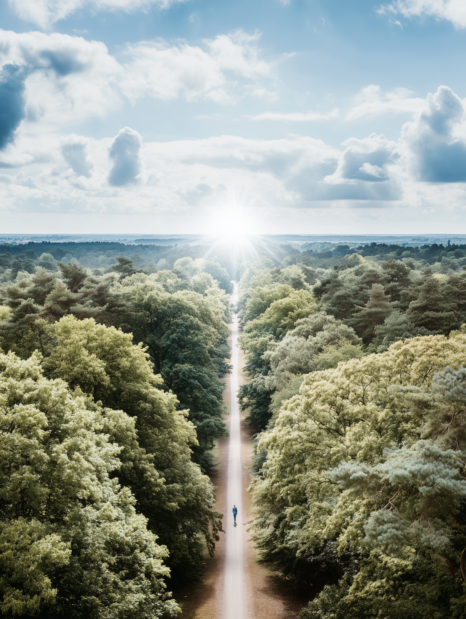
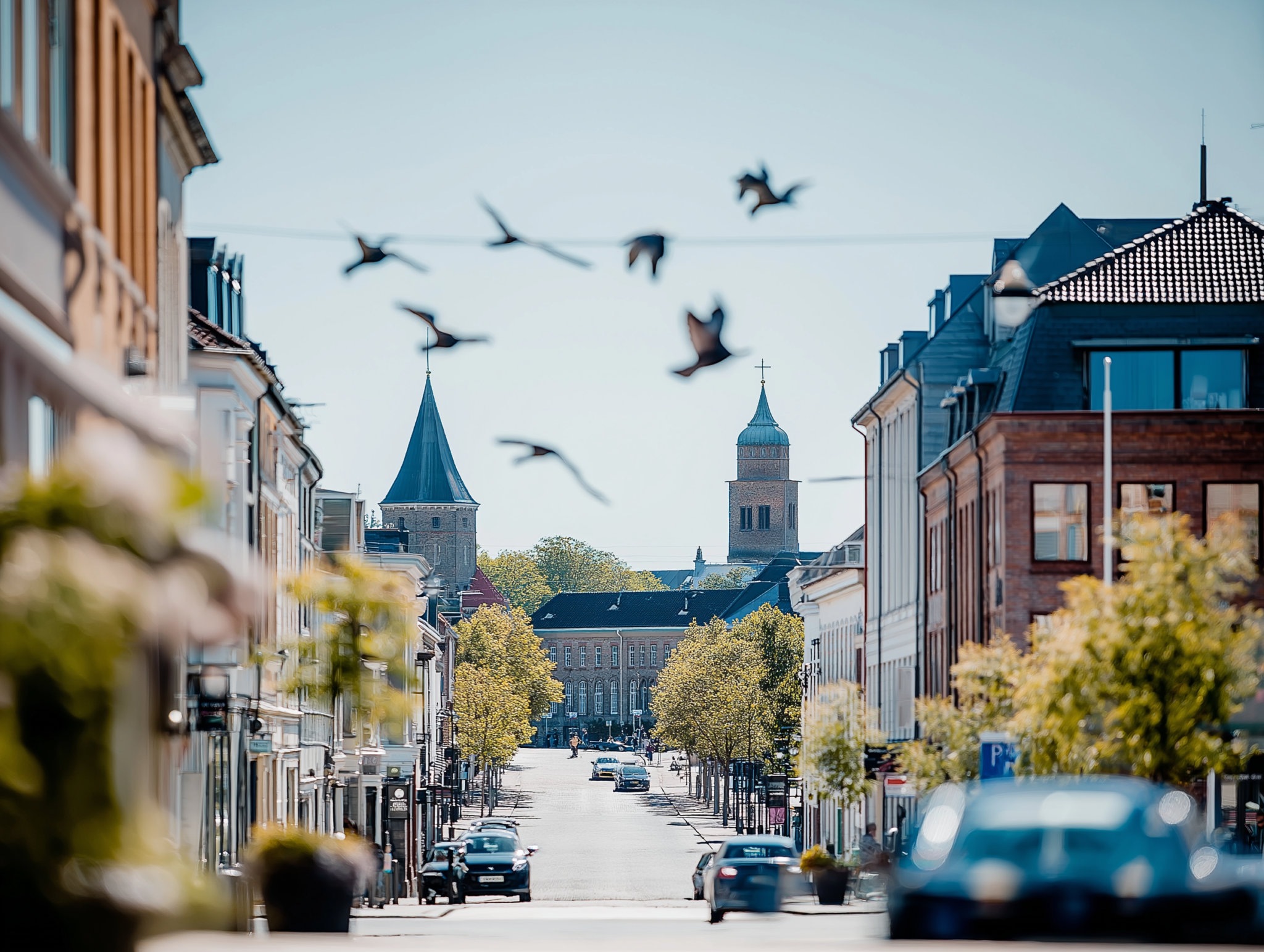

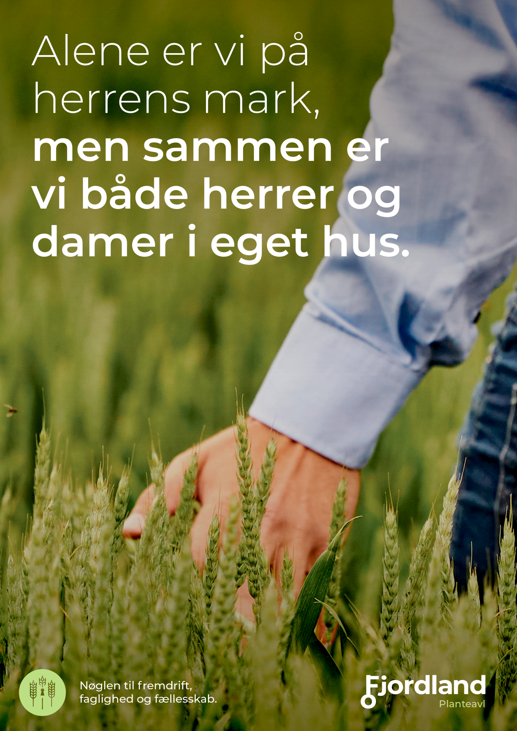
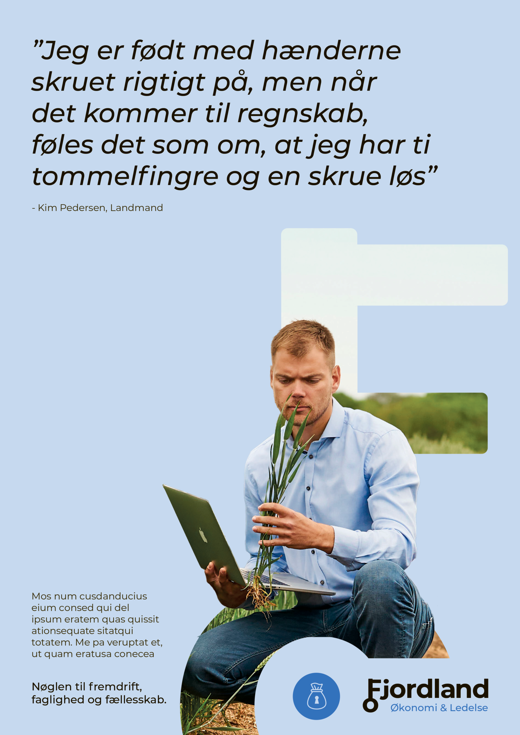
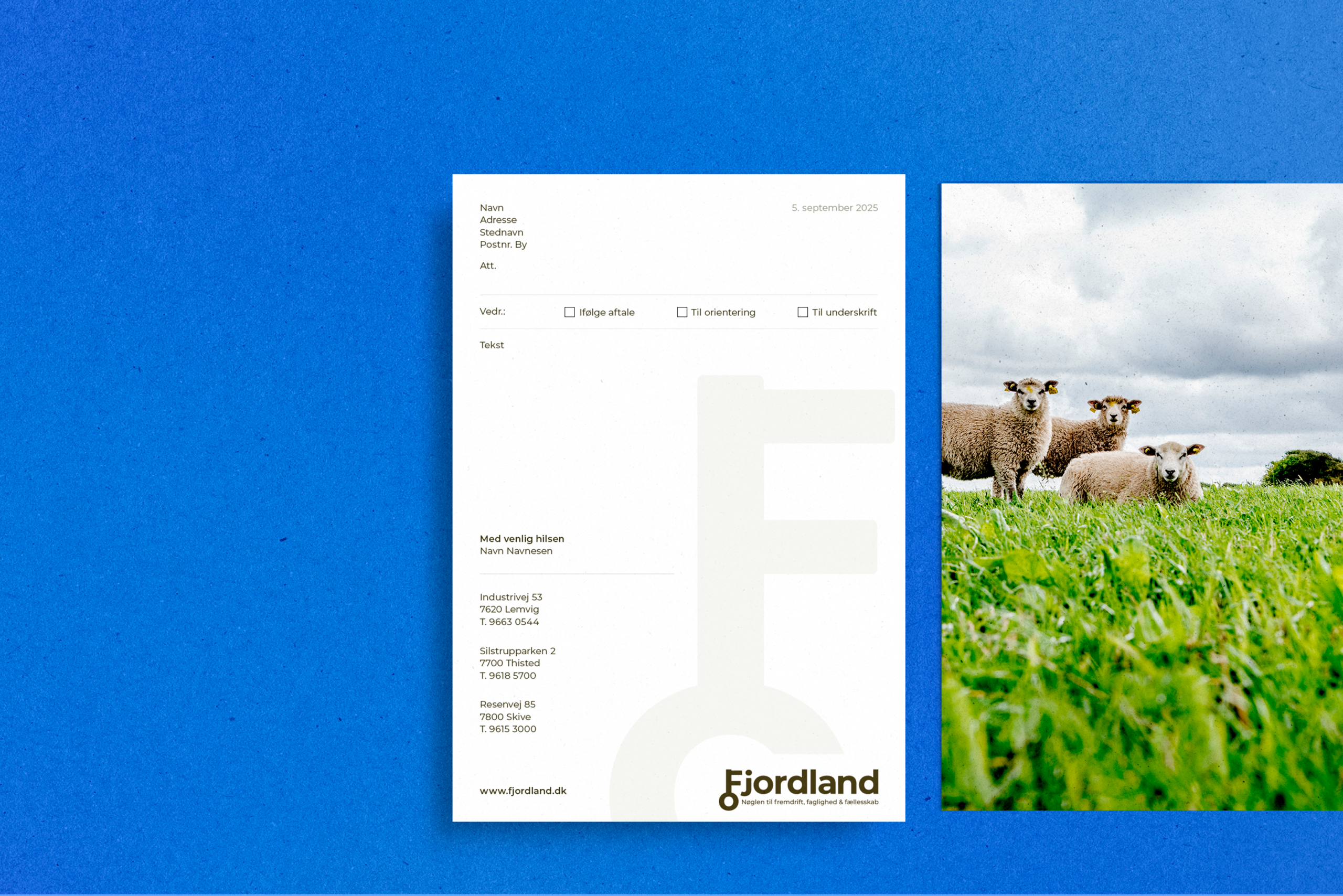
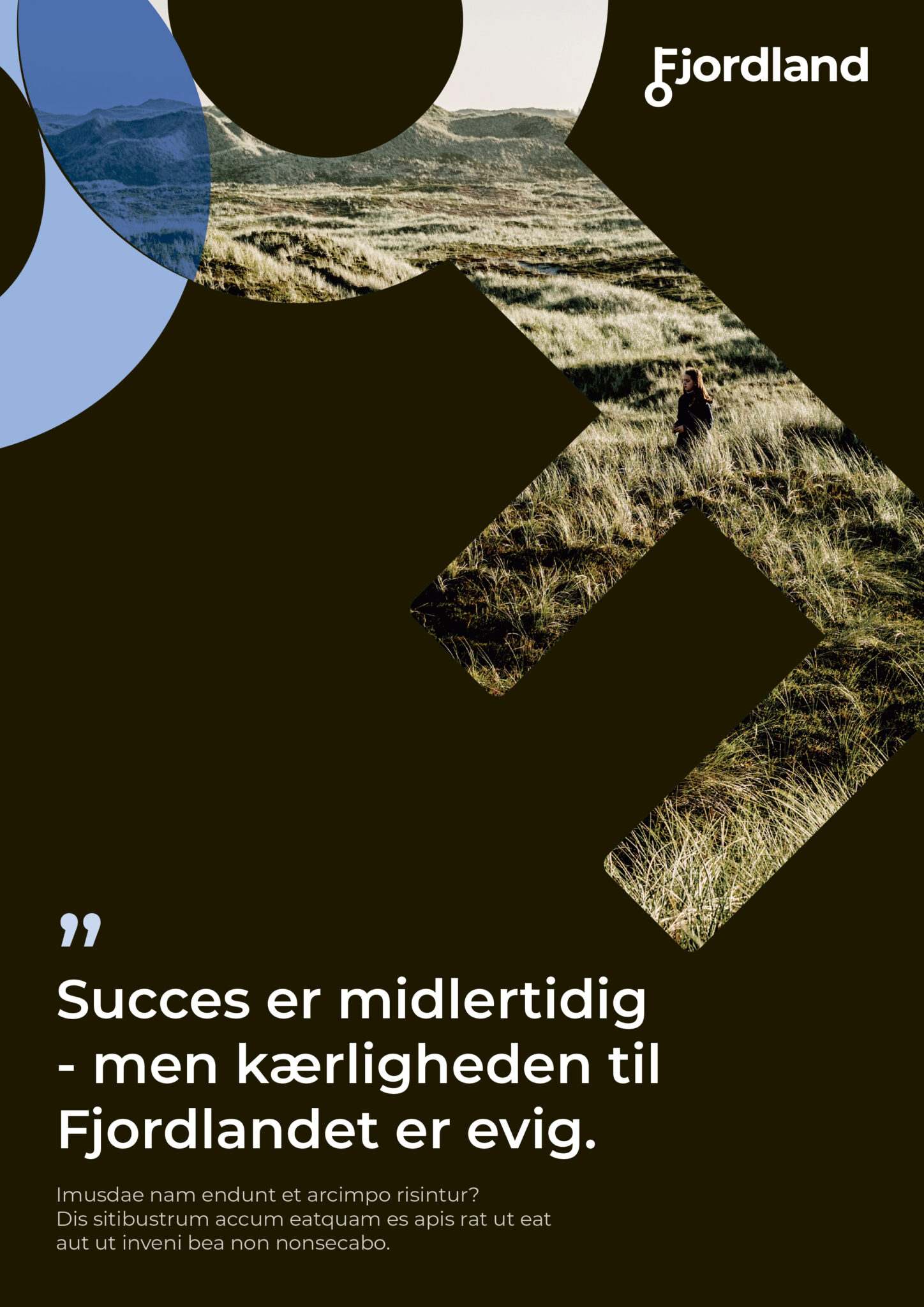
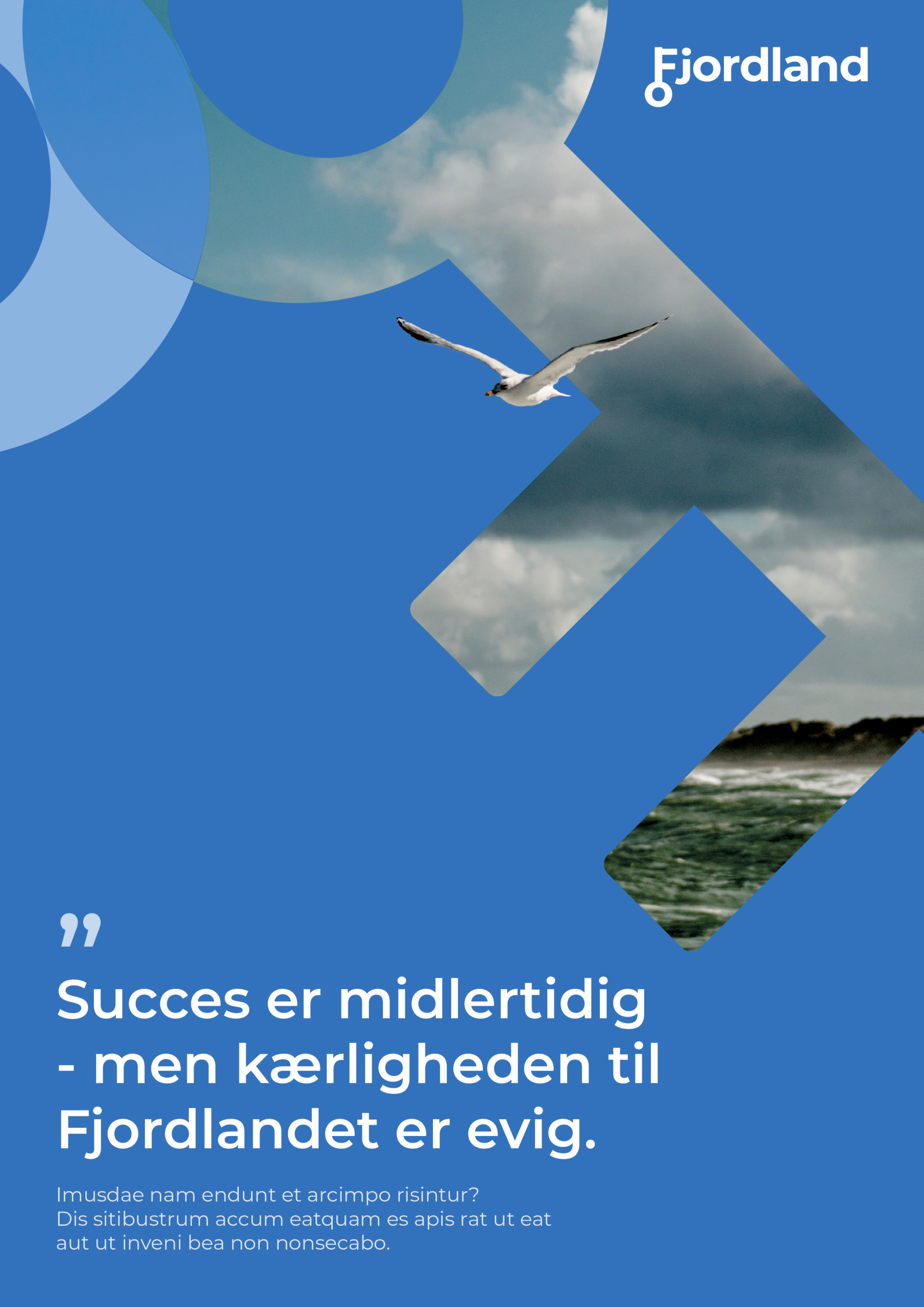
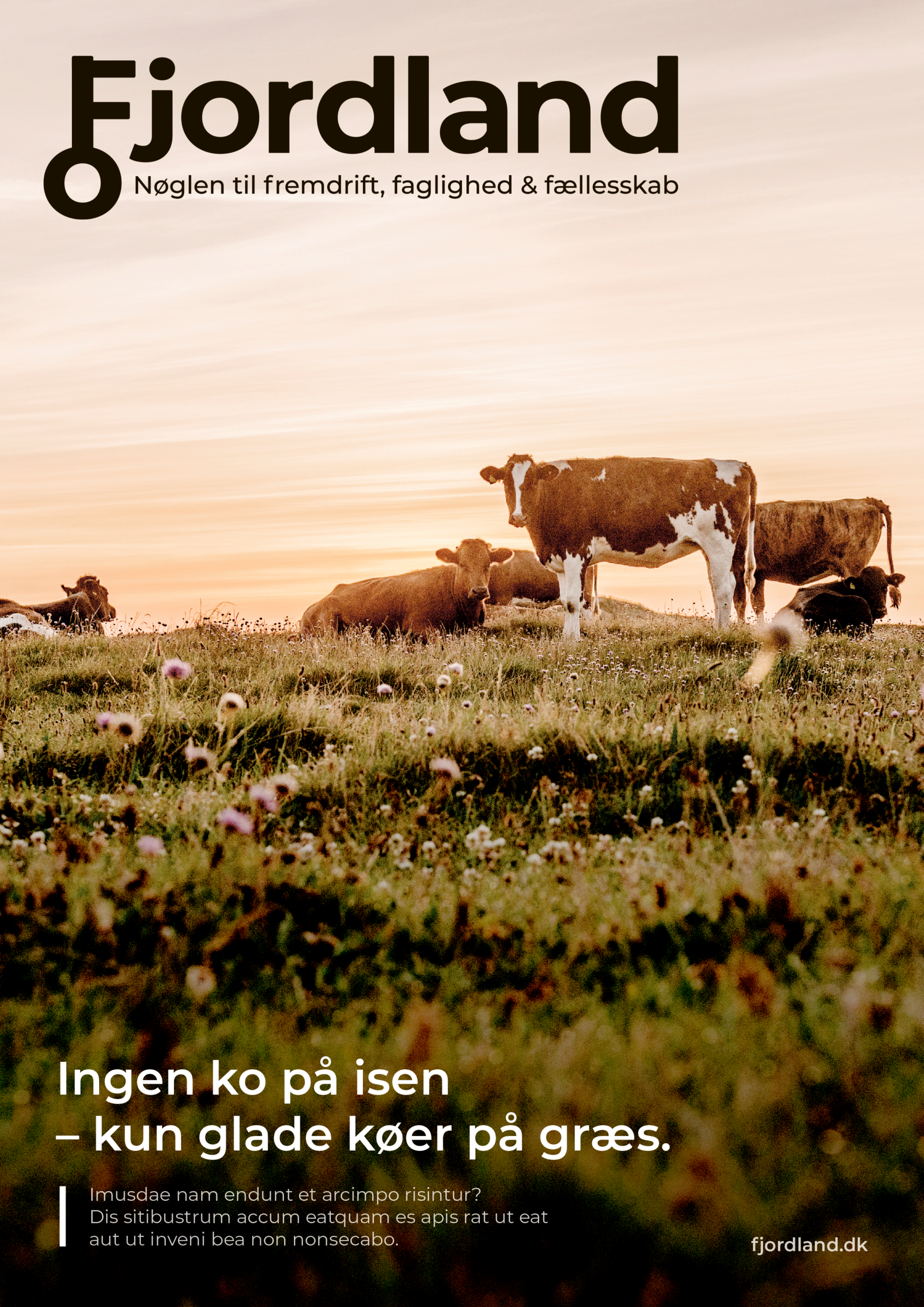
Fjordland had an updated strategic brand foundation, where the concept of a “key” played an important role in the communication. The task was to develop a new visual identity that could support this narrative while also allowing the brand to communicate clearly to several different audiences.
Because Fjordland needs to speak to many stakeholders, the identity had to create room for differentiation without losing consistency. I worked with graphic key elements, a flexible icon style and colour choices with subtle references to landbrug og fødevarer. The result was a visual universe where icons could be used in a natural and eye-catching way to guide the communication, support different messages and create stronger recognition across the brand.
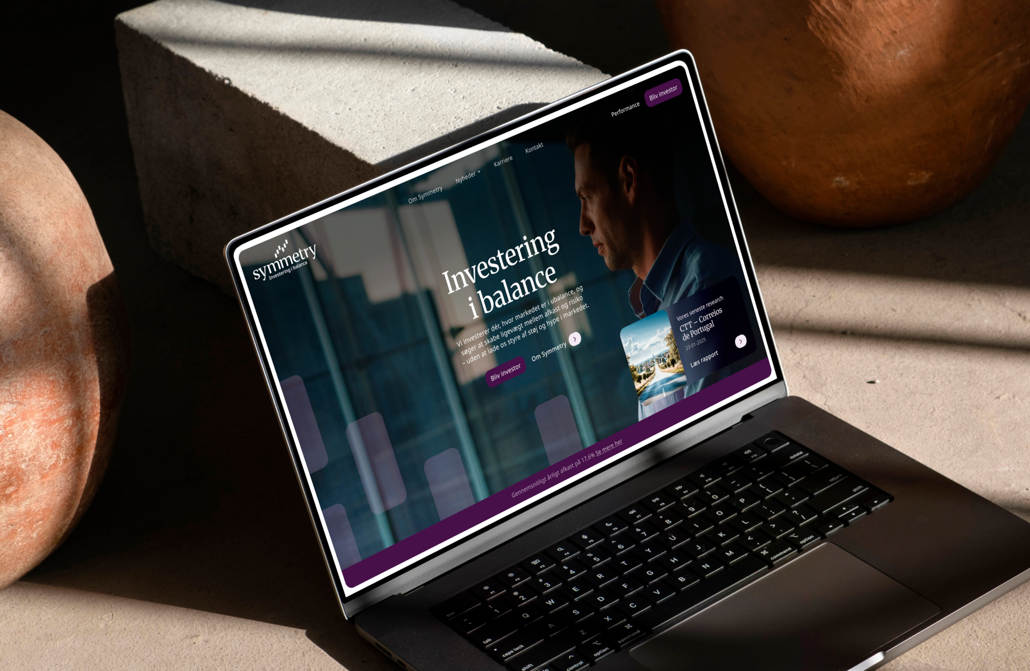
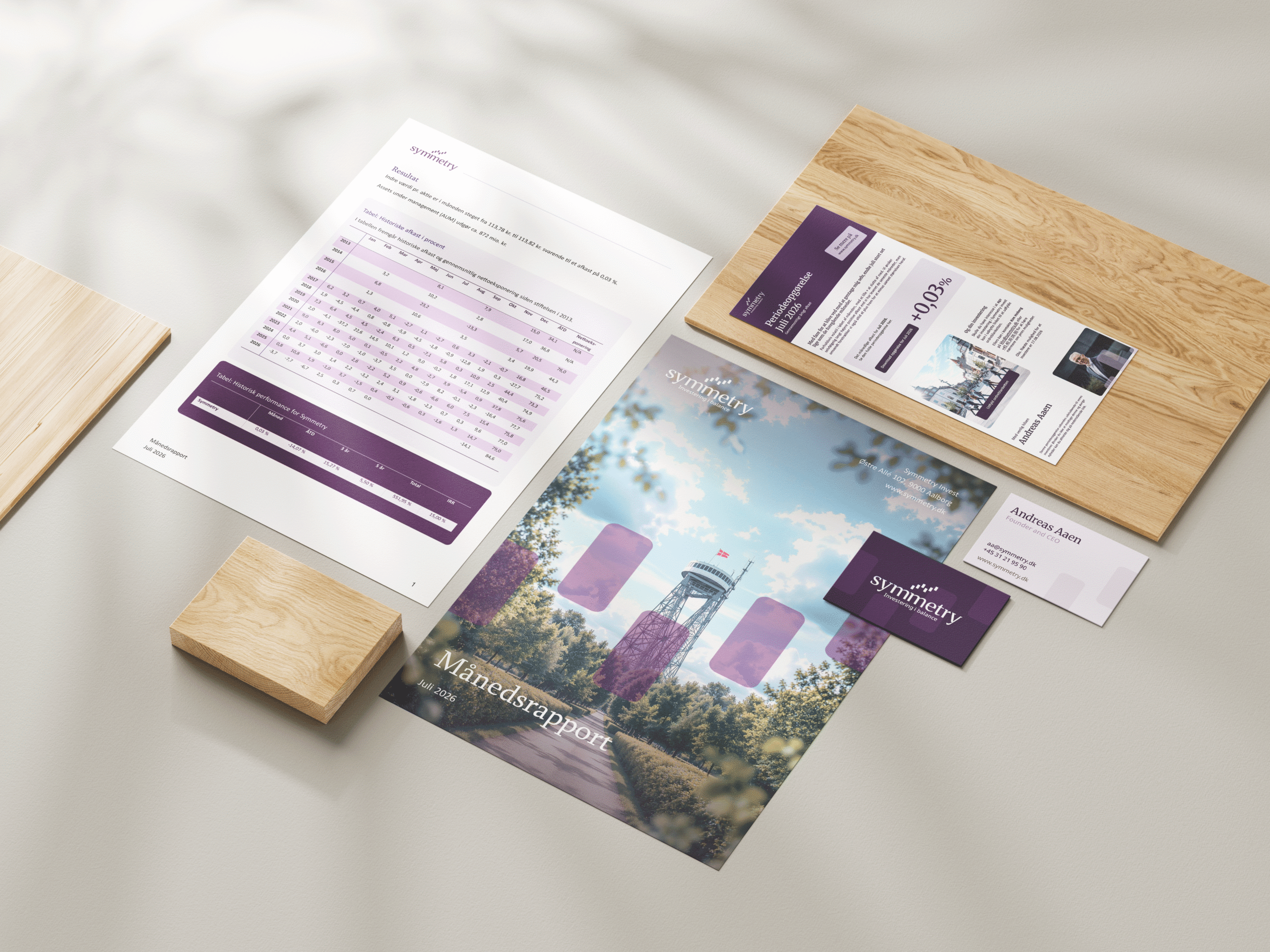
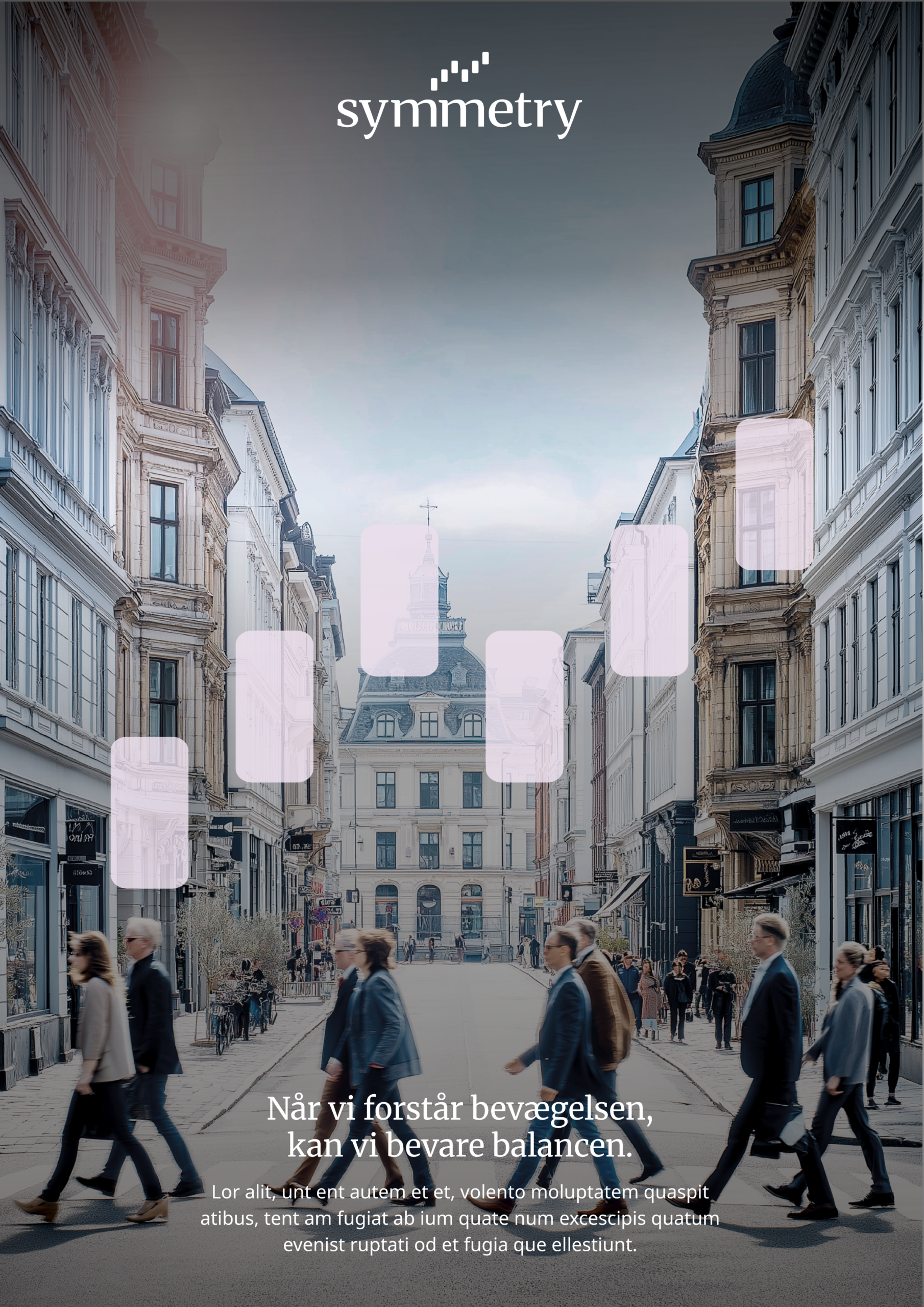
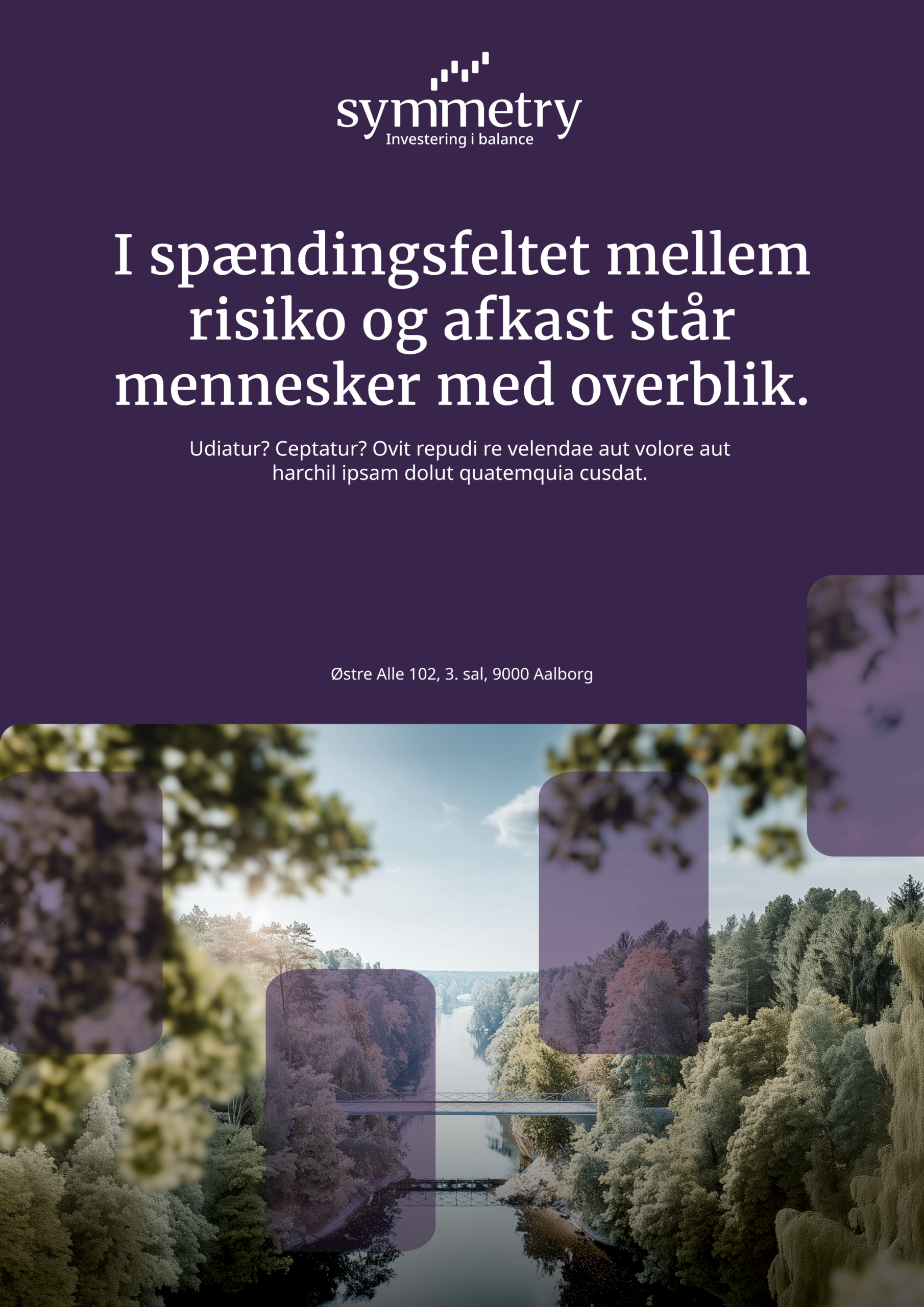
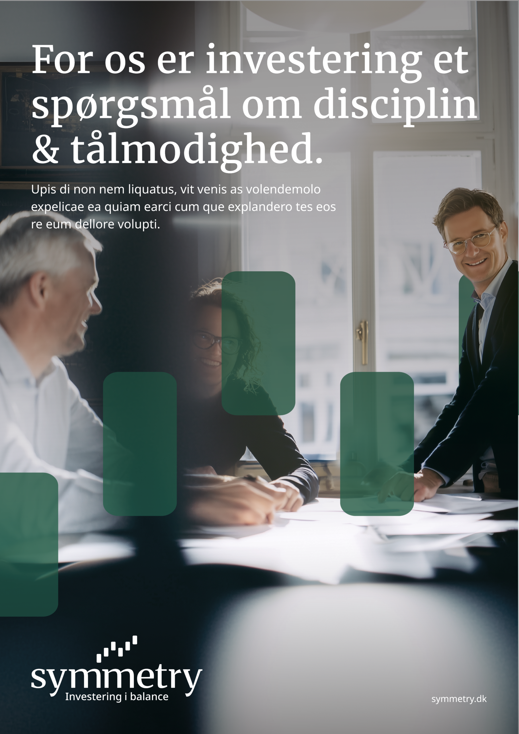
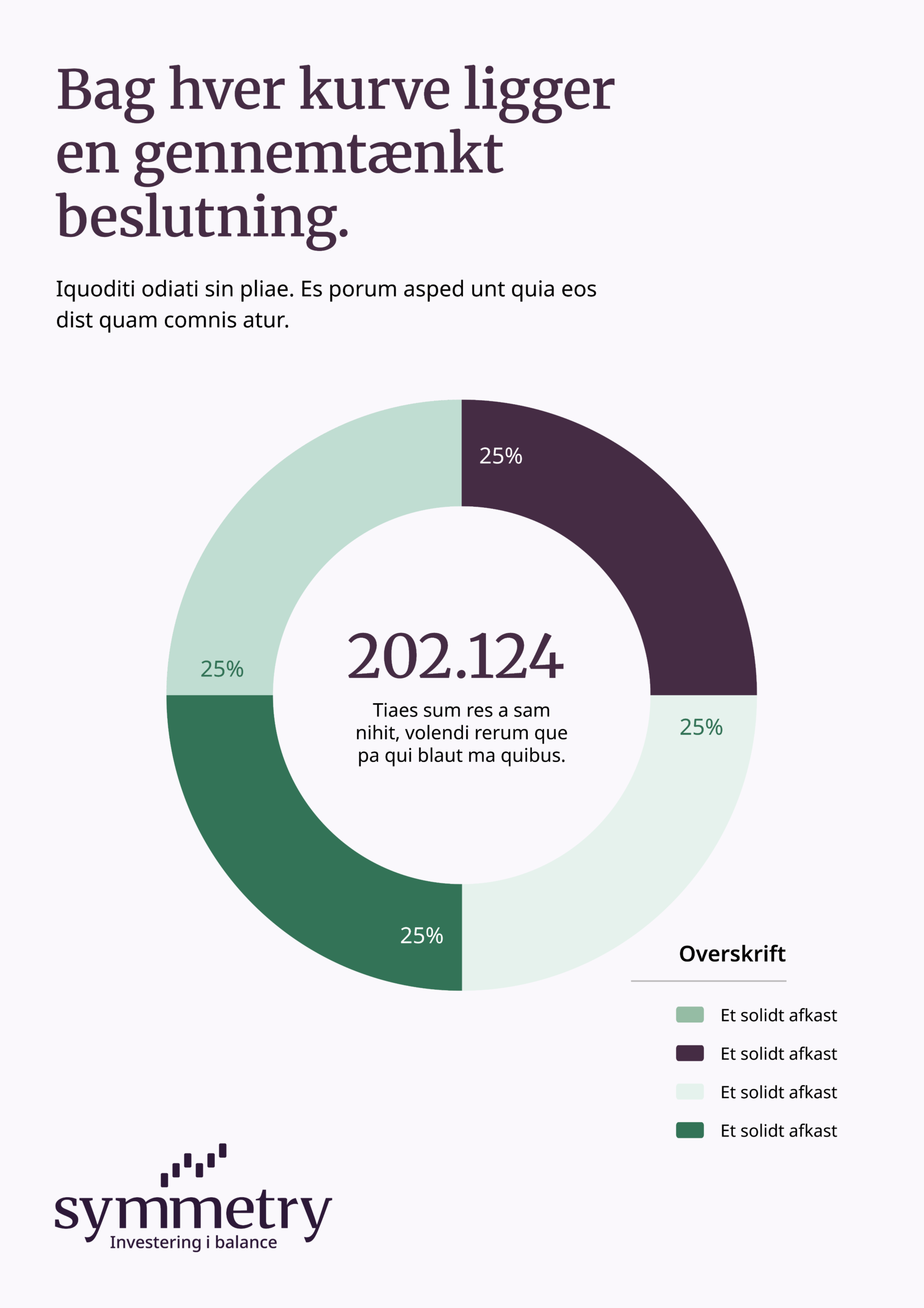
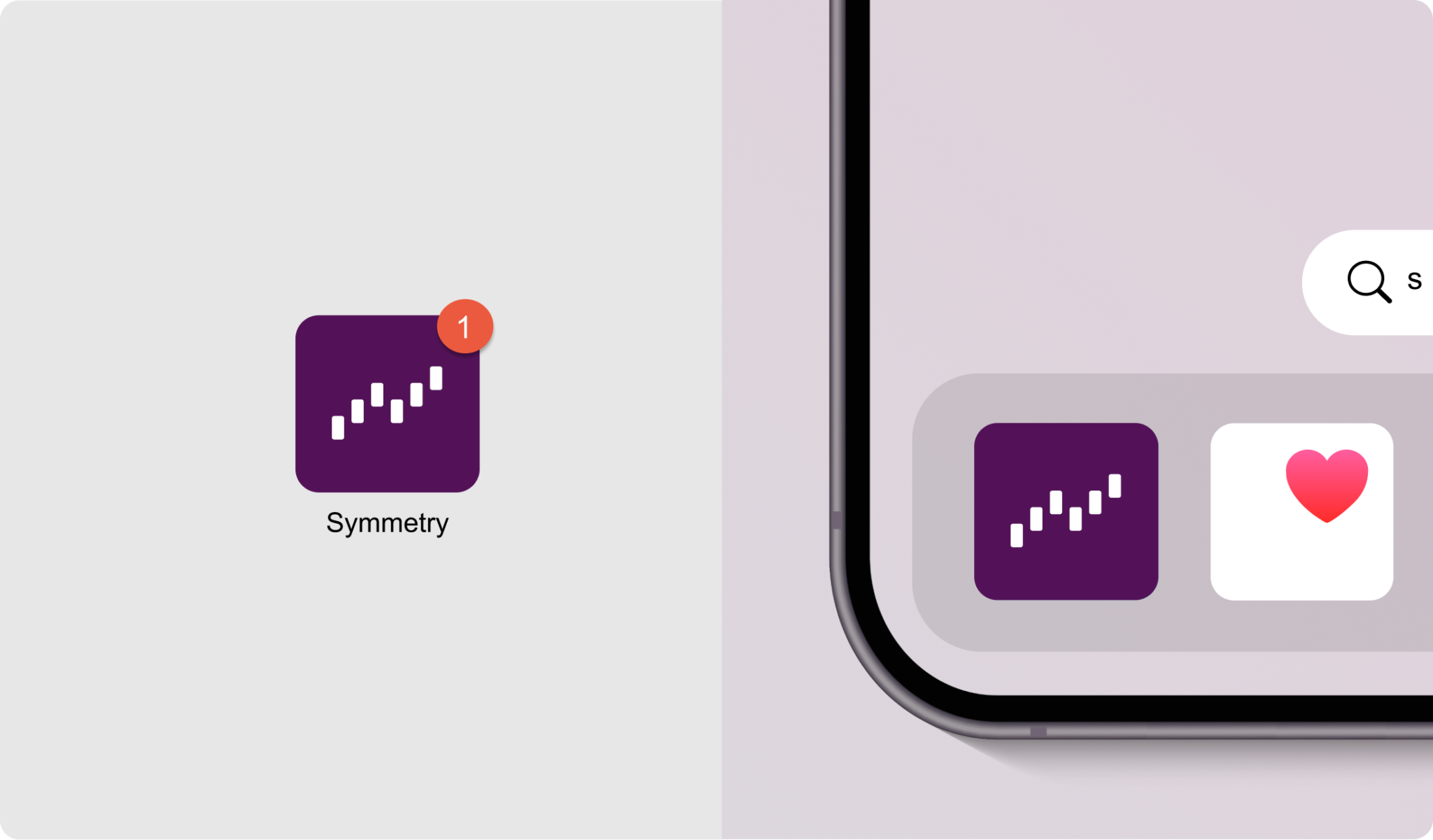
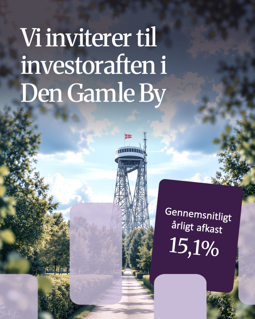
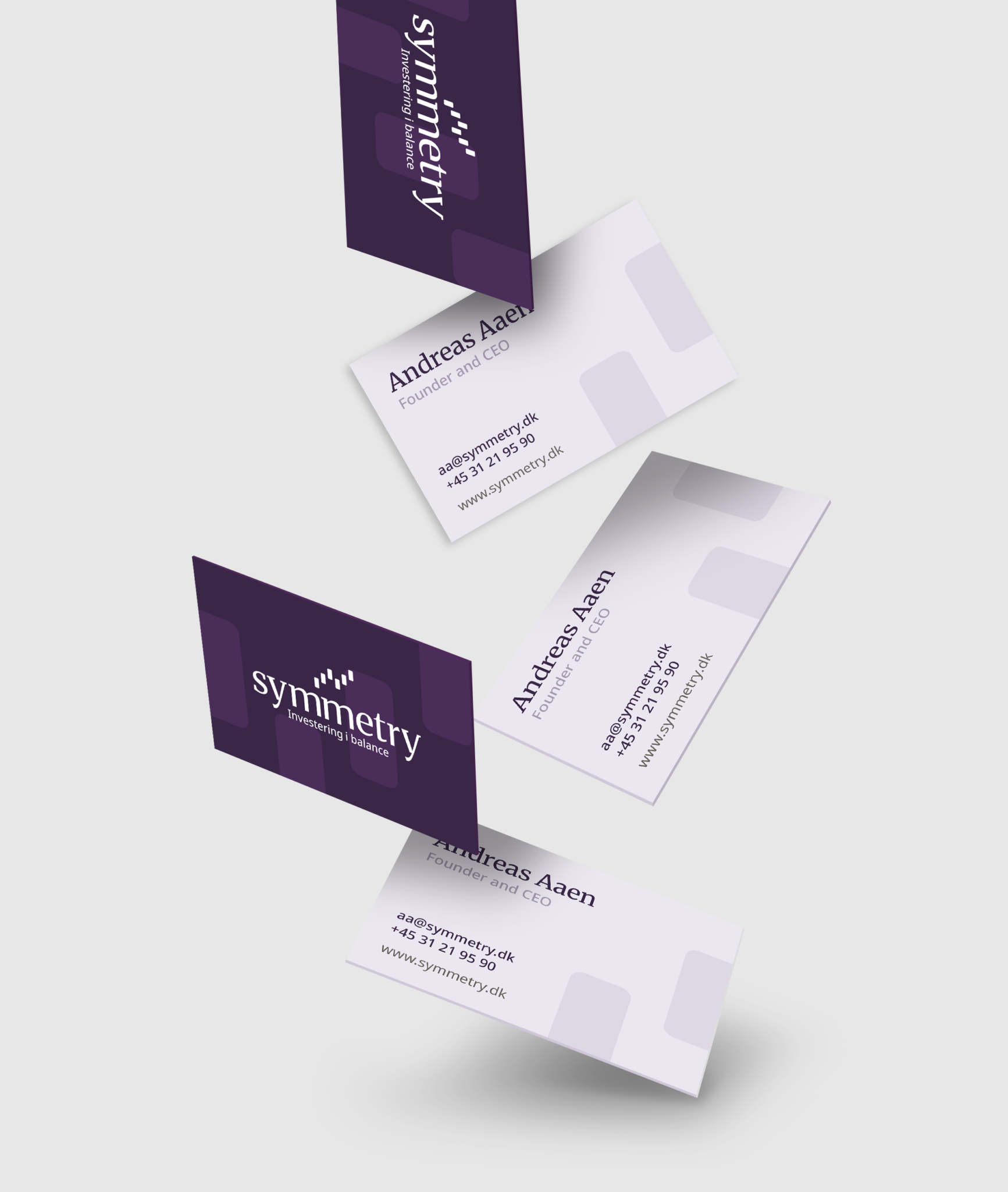
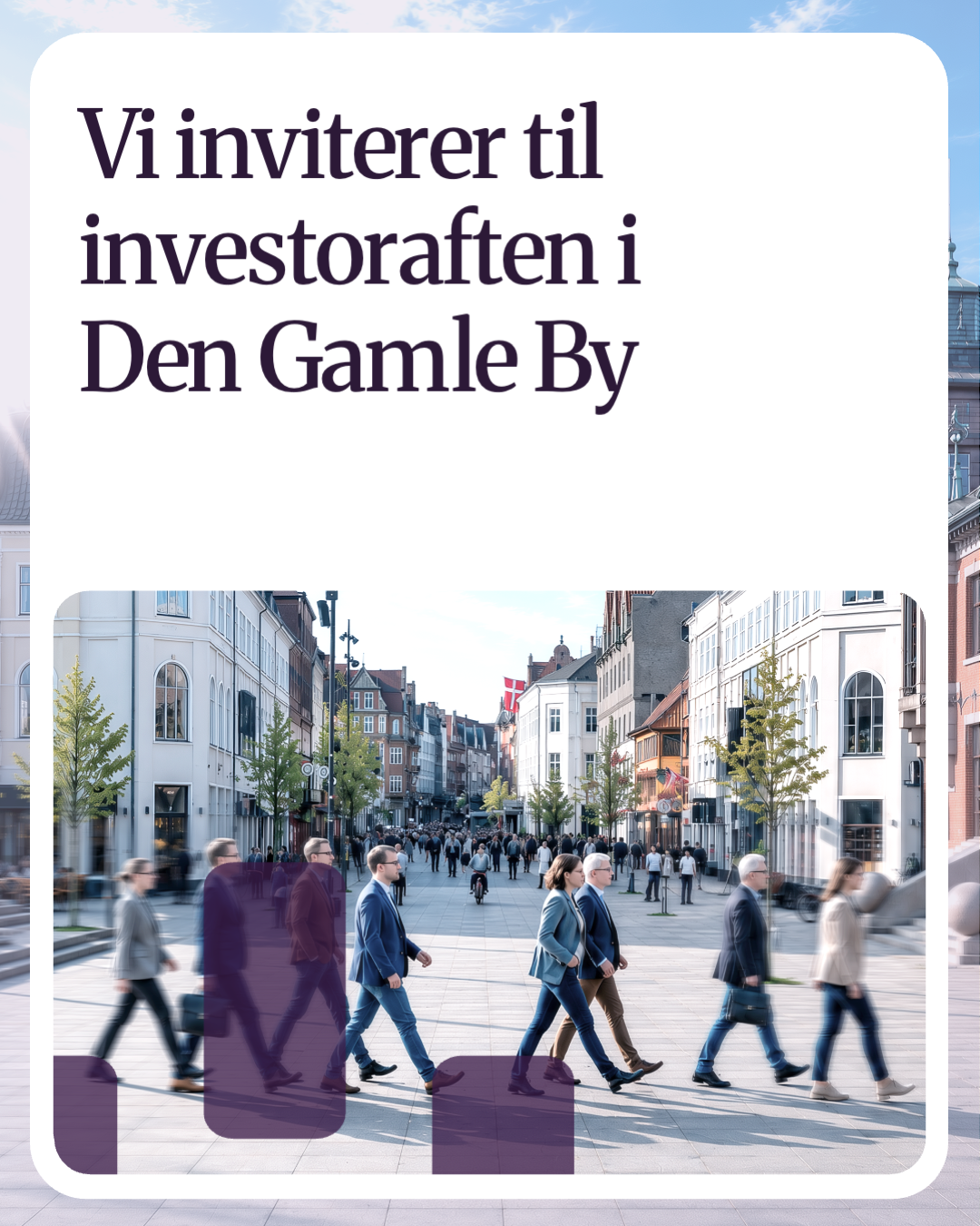
Symmetry is an investment brand built around stock investments and strong financial performance. The brand needed a visual identity that could match the professionalism and credibility already reflected in their results.
With a new strategic foundation in place, my role was to translate the brand strategy into a complete visual identity from the ground up. The identity was developed to express Symmetry’s product, values and professional position through a dynamic visual system, including logo, shapes, colours, typography, animations and supporting brand elements.



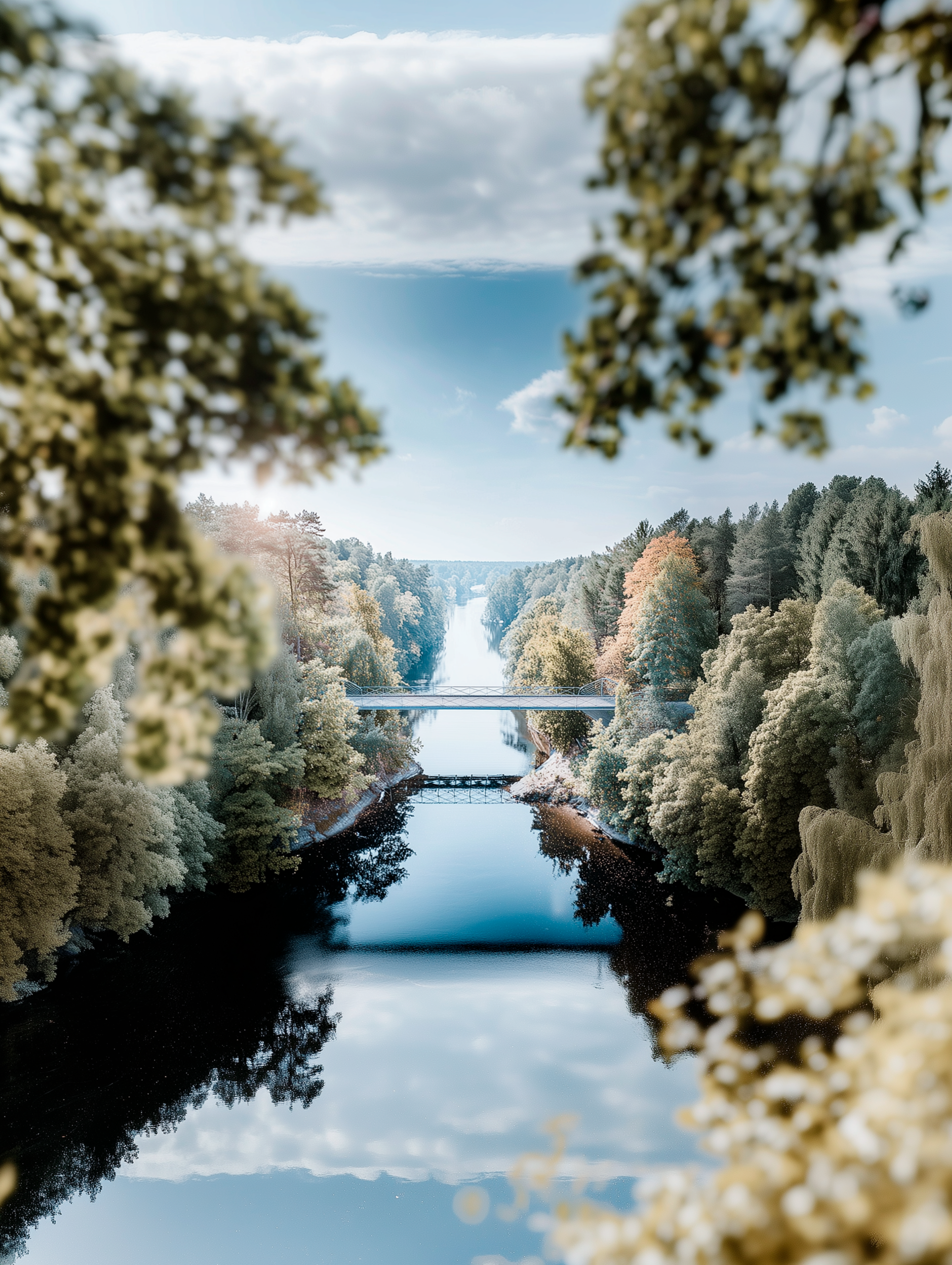
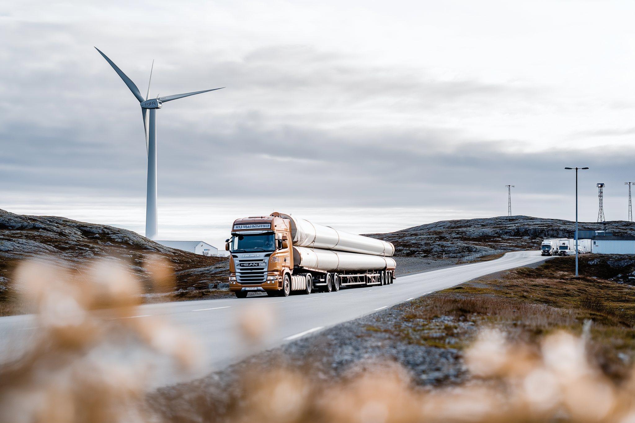
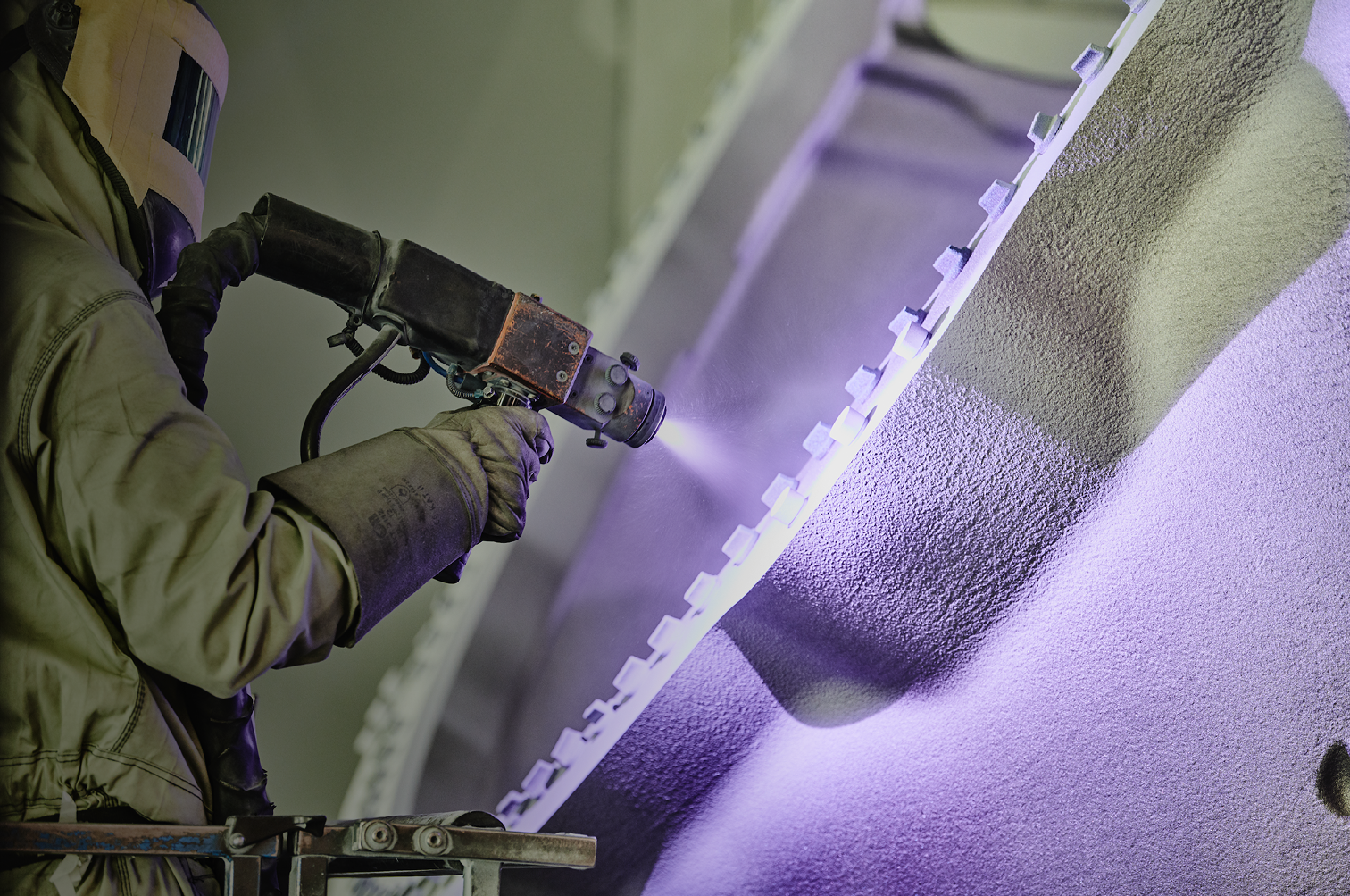
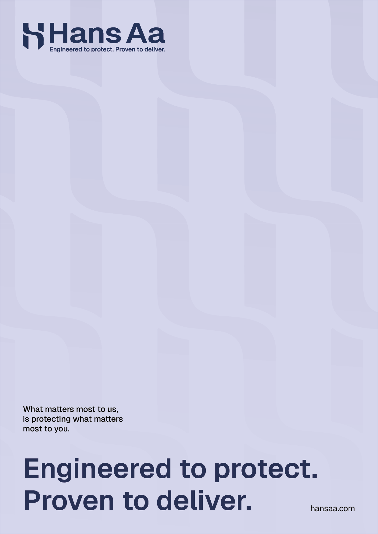
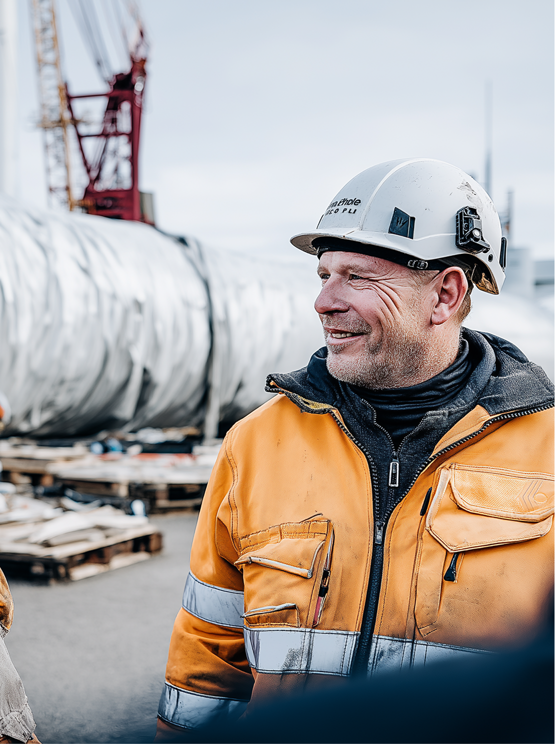
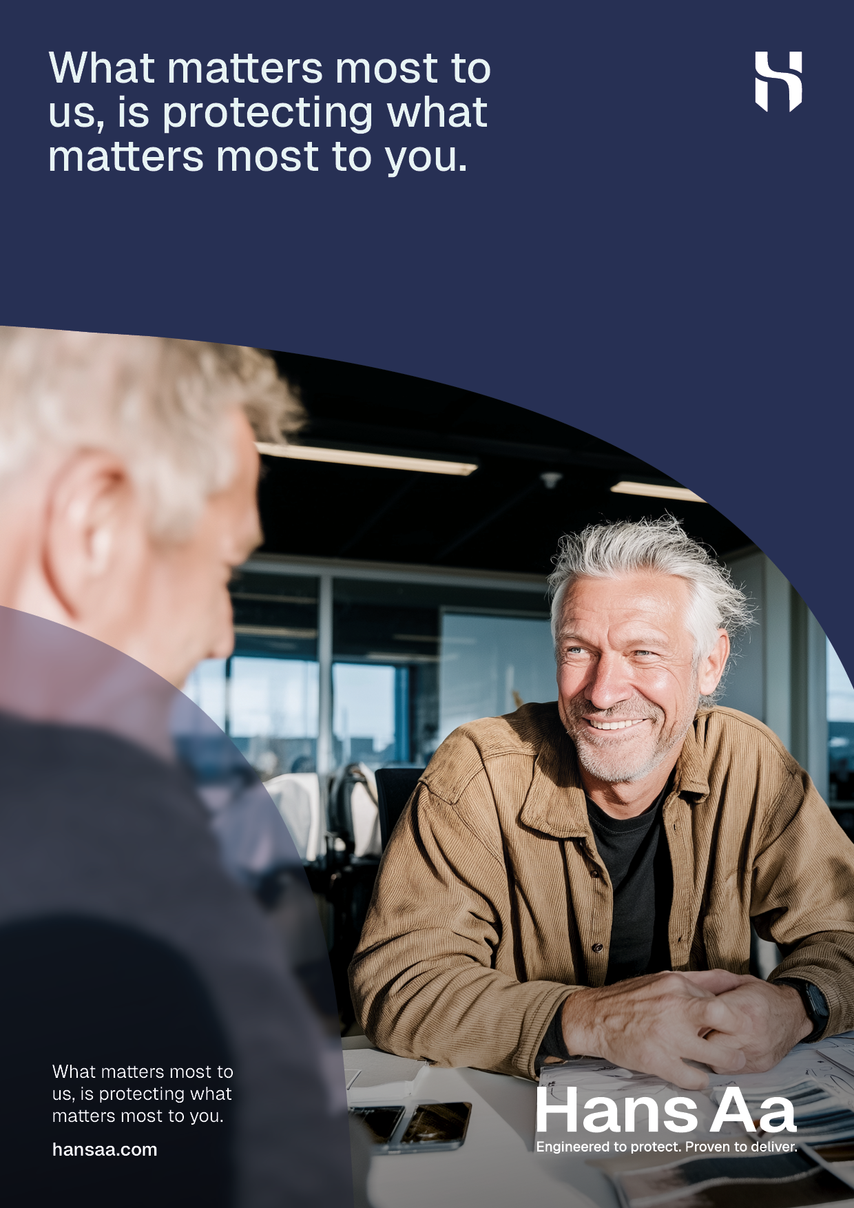
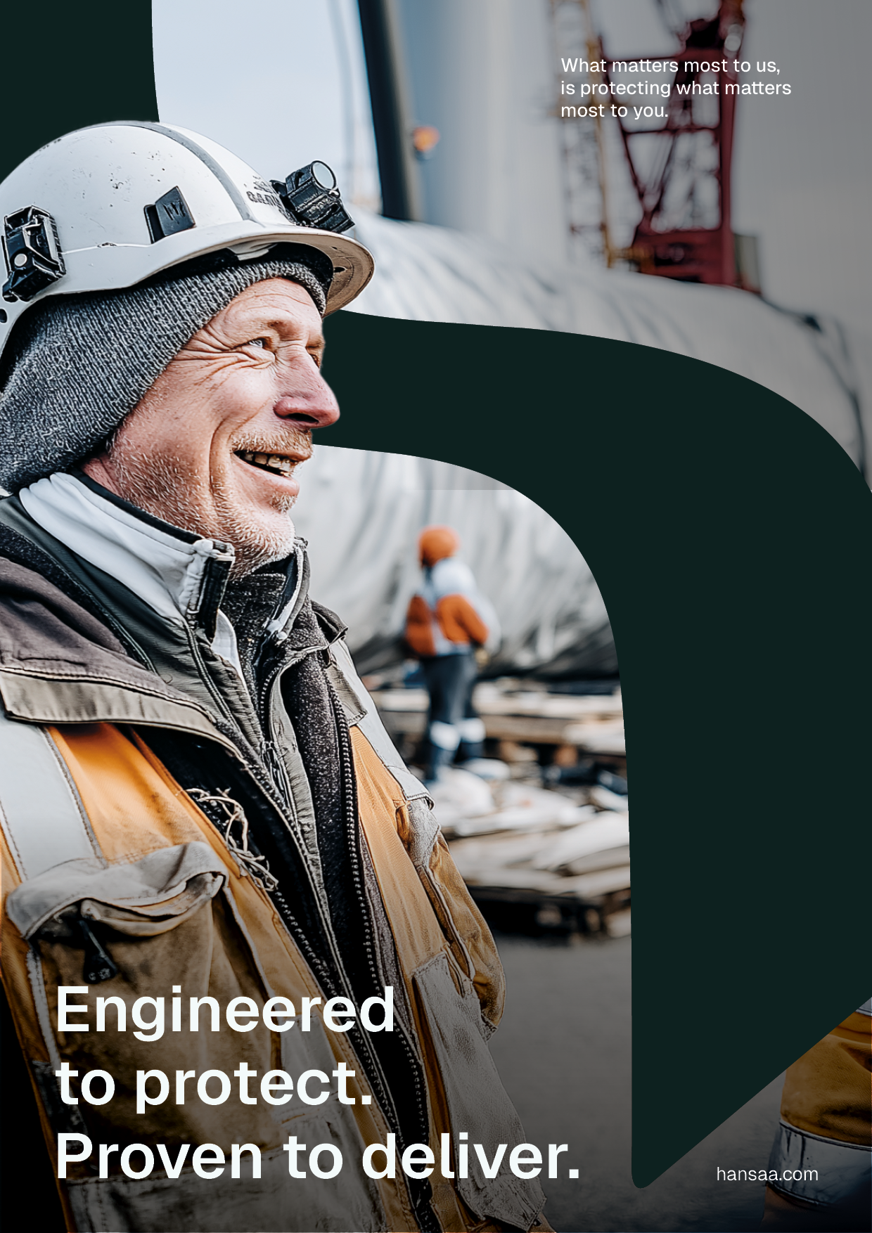
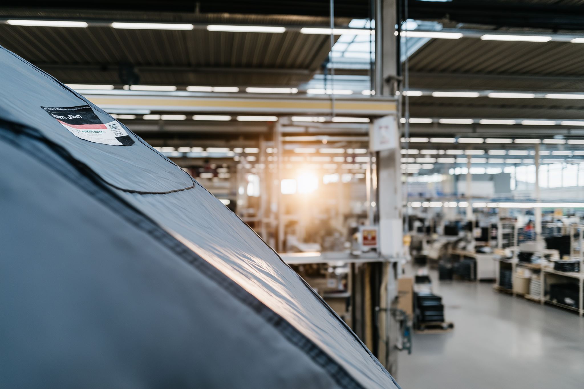
Hans Aa needed to update their brand expression as their product portfolio and strategy were changing. The goal was to create a more dynamic and corporate identity that could support their shift towards advisory services and full-solution offerings.
The concept shown here was my first creative proposal, including a redesigned logo inspired by both a shield and the tarpaulin material behind their products. The client later kept their existing logo, but adopted the colour direction and execution style from this proposal.


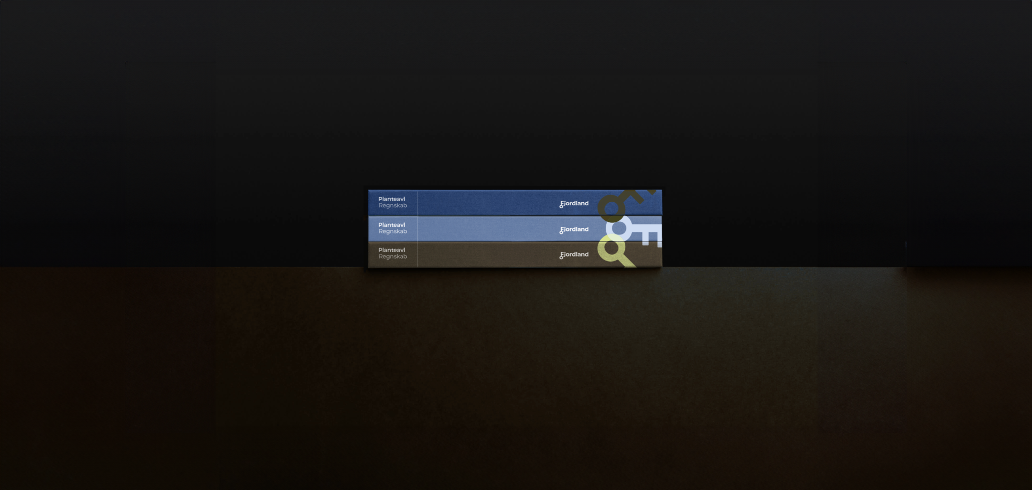
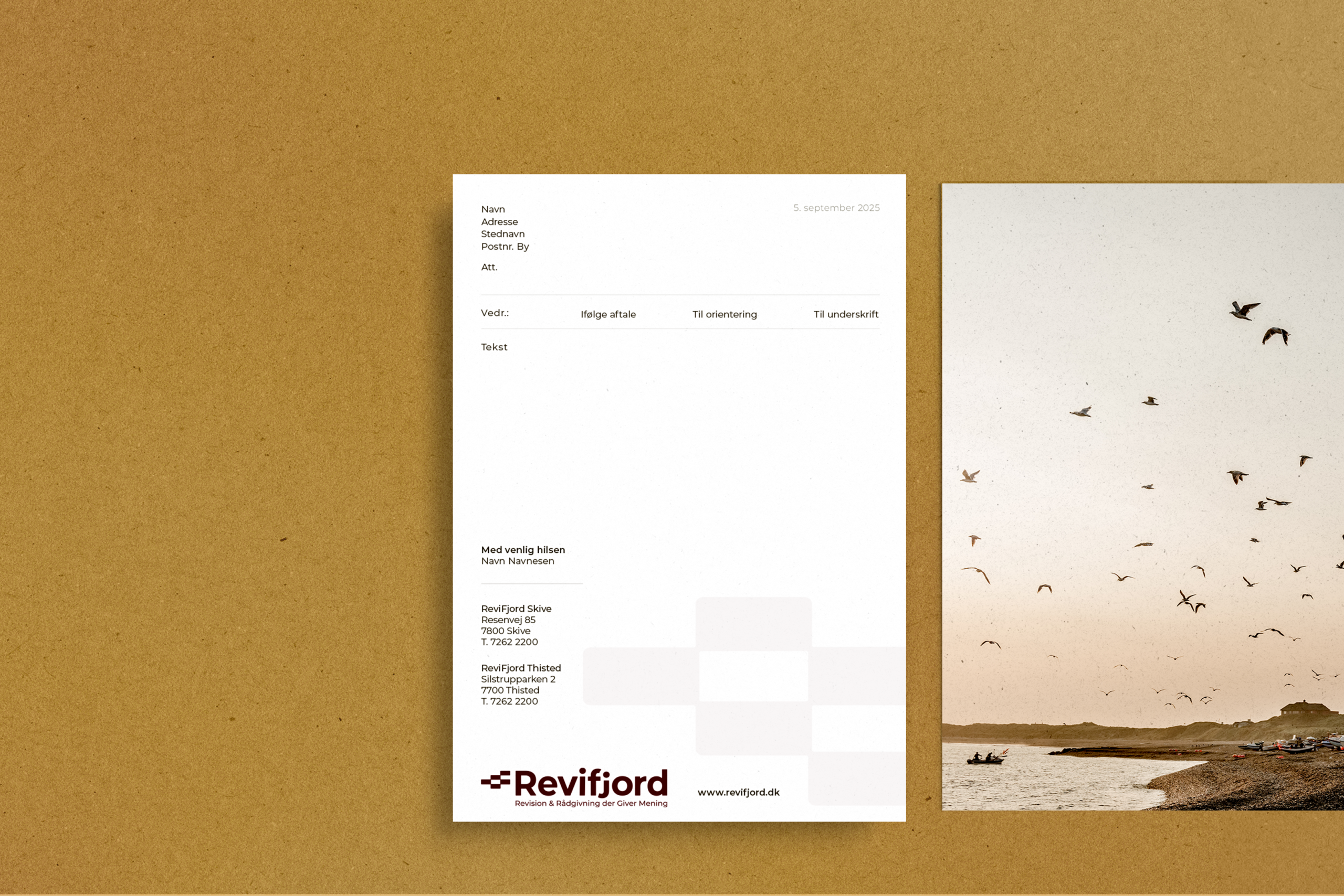
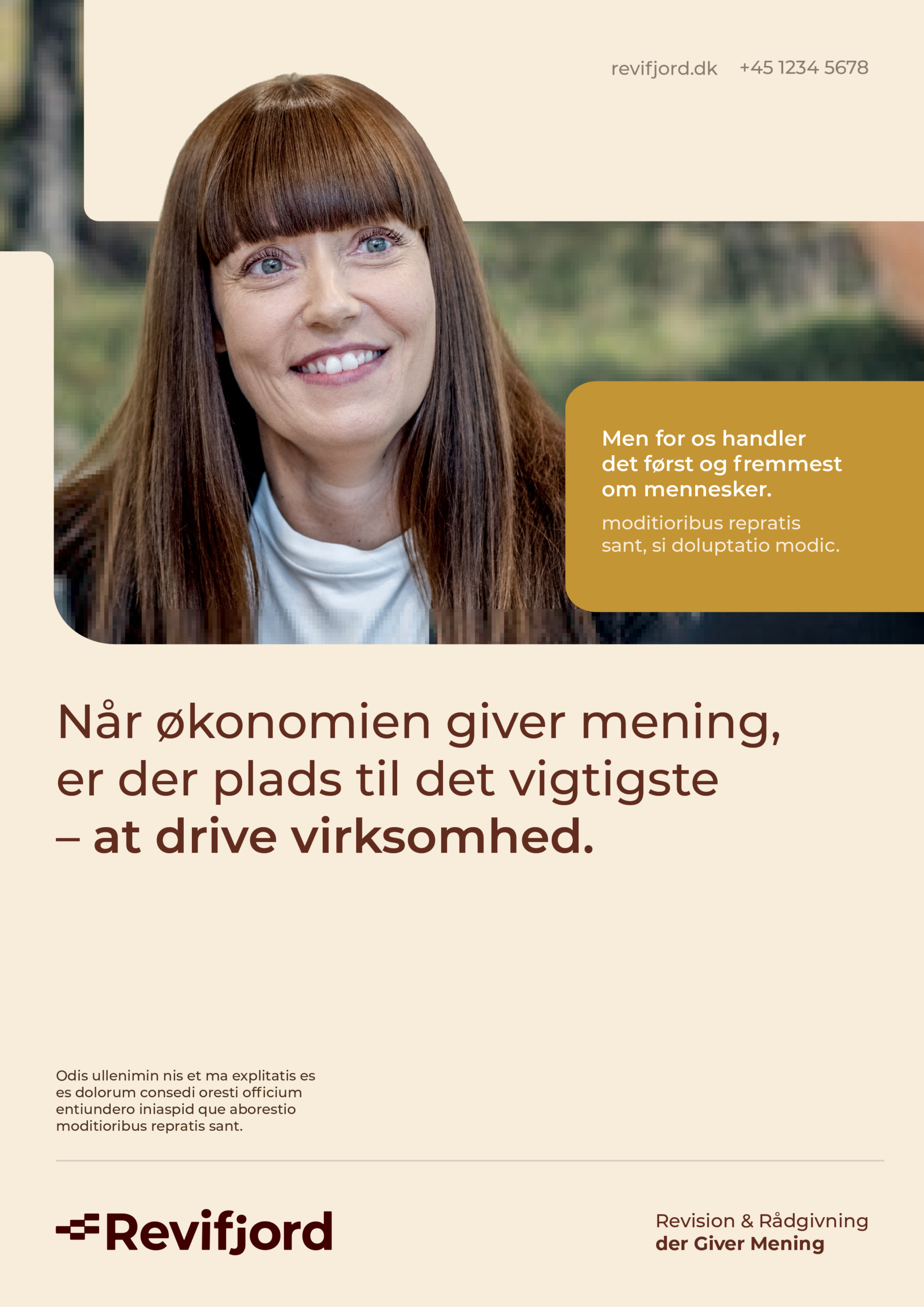
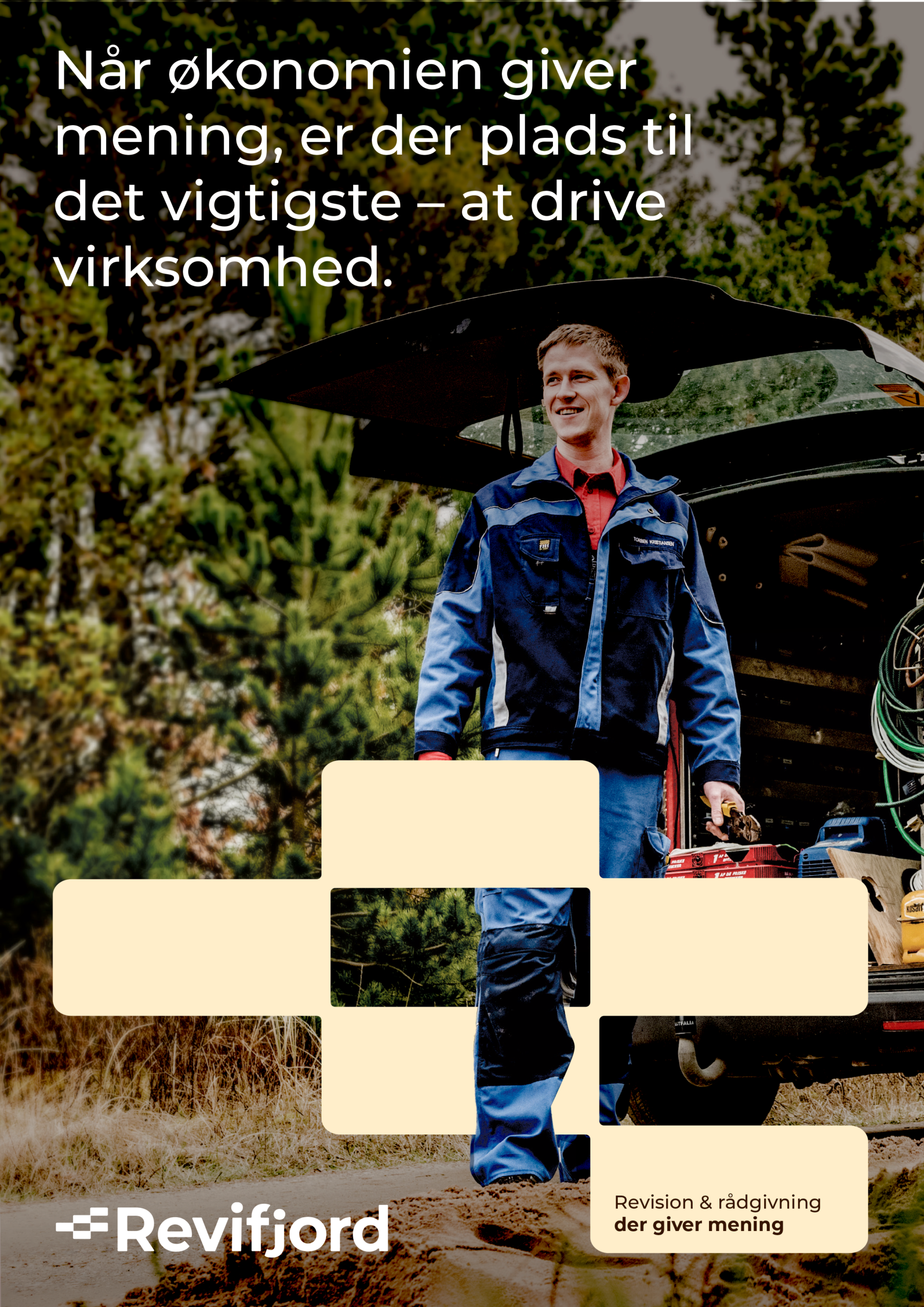
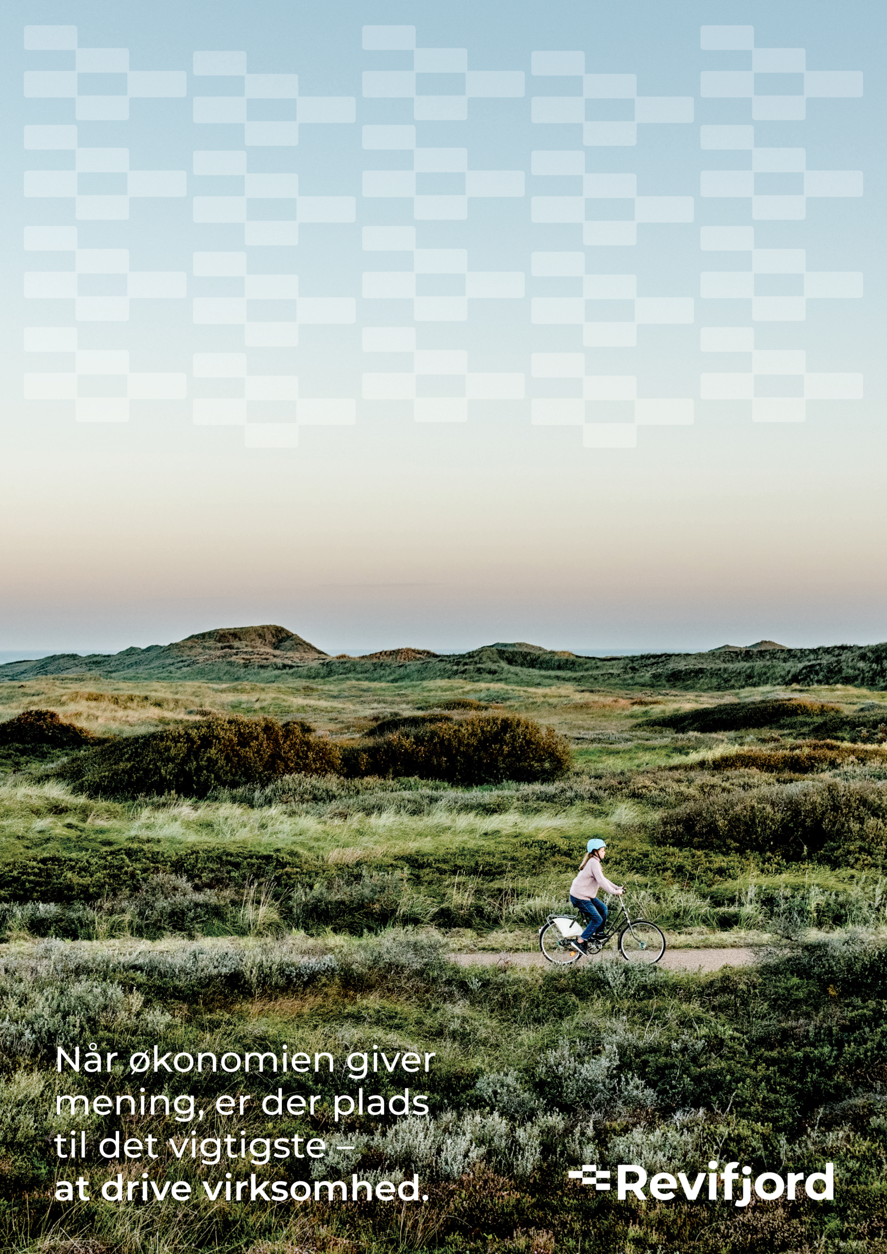
Revifjord was developed as a sister brand to Fjordland. The two identities needed to feel connected, but still have their own distinct creative worlds. To create this separation, the visual direction for Revifjord was built around stronger contrasts in both colour and form.
The identity takes direct inspiration from Revifjord’s core service: accounting and auditing. The logo and graphic system are shaped by the logic of spreadsheets, with references to columns, rows and structured financial overview. This gave the brand a visual language that feels precise and professional, while still allowing room for movement and personality.
To bring the system to life, the animation expands on the same idea by showing rows being created within a sheet. In that way, the identity becomes more than a static mark — it becomes a dynamic brand universe rooted in the product itself.


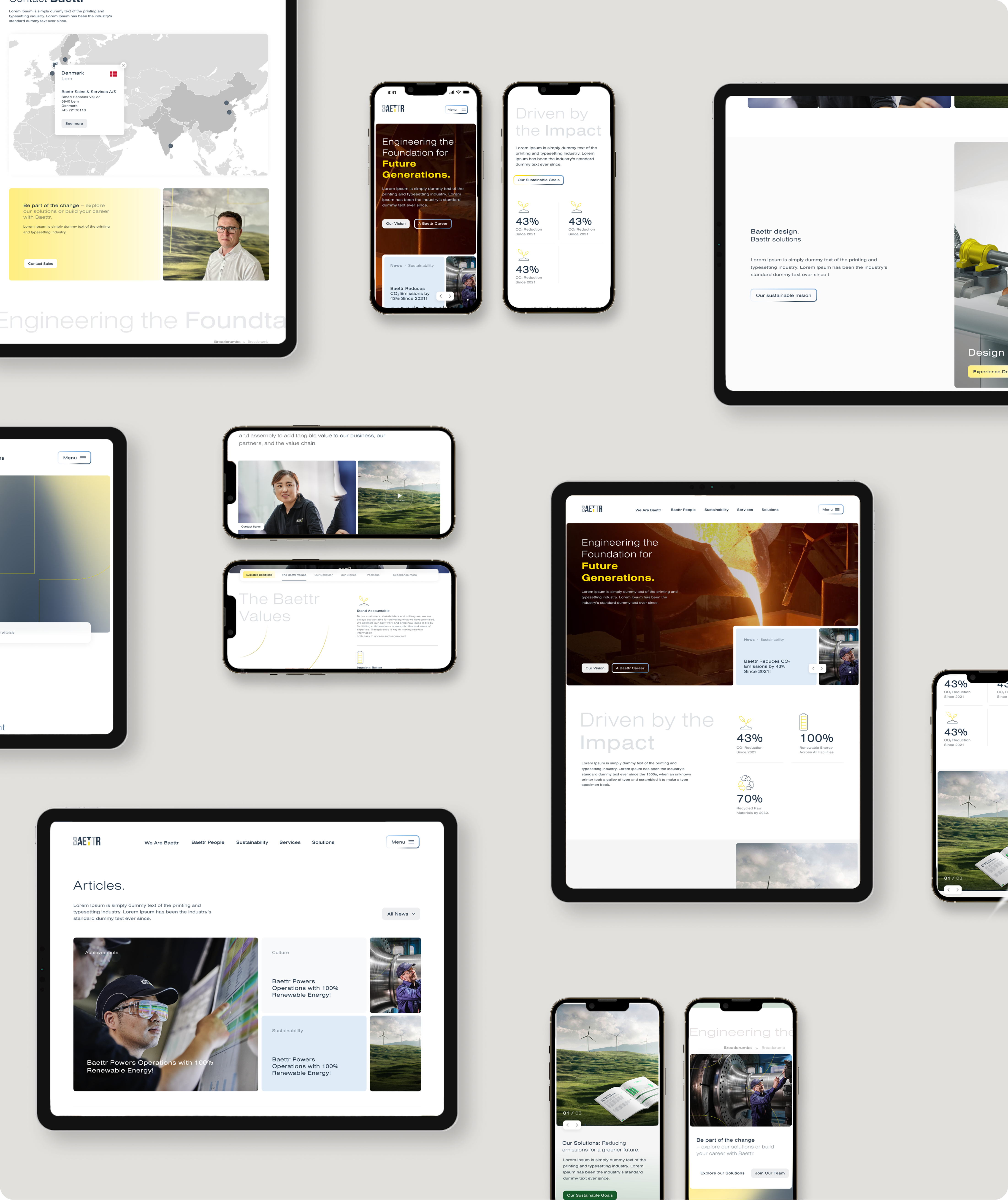
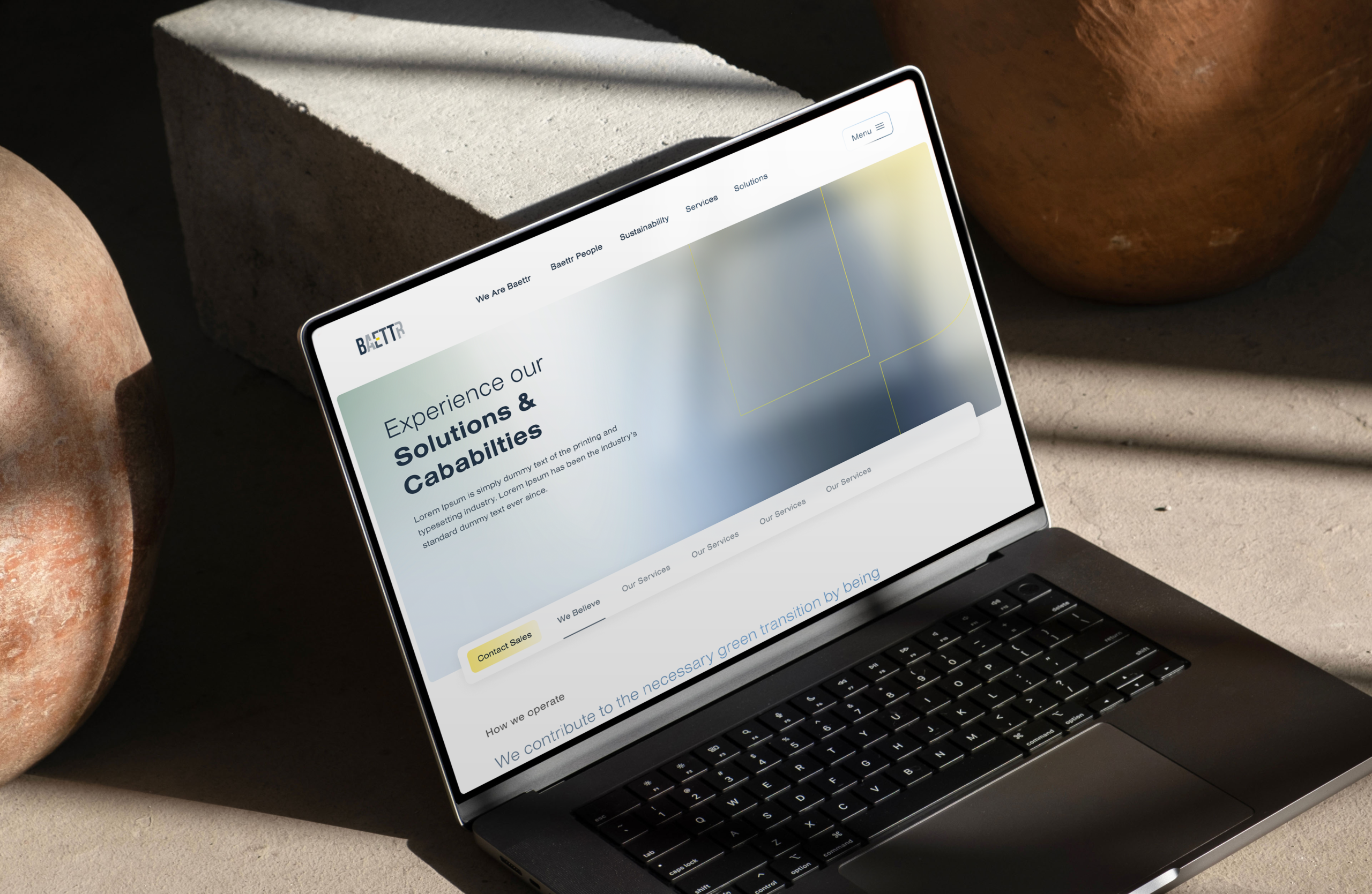
Baettr needed a digital platform that could bring their identity into a more modern, bright and 2.0 expression, while communicating clearly to audiences with different needs. The project required a clear structure that could support both the internal people-focused communication and the external customer-facing business narrative. Through user journeys, content hierarchy and digital design, the platform was shaped to make complex information easier to navigate, more relevant to each audience and more aligned with Baettr’s future-facing brand presence.
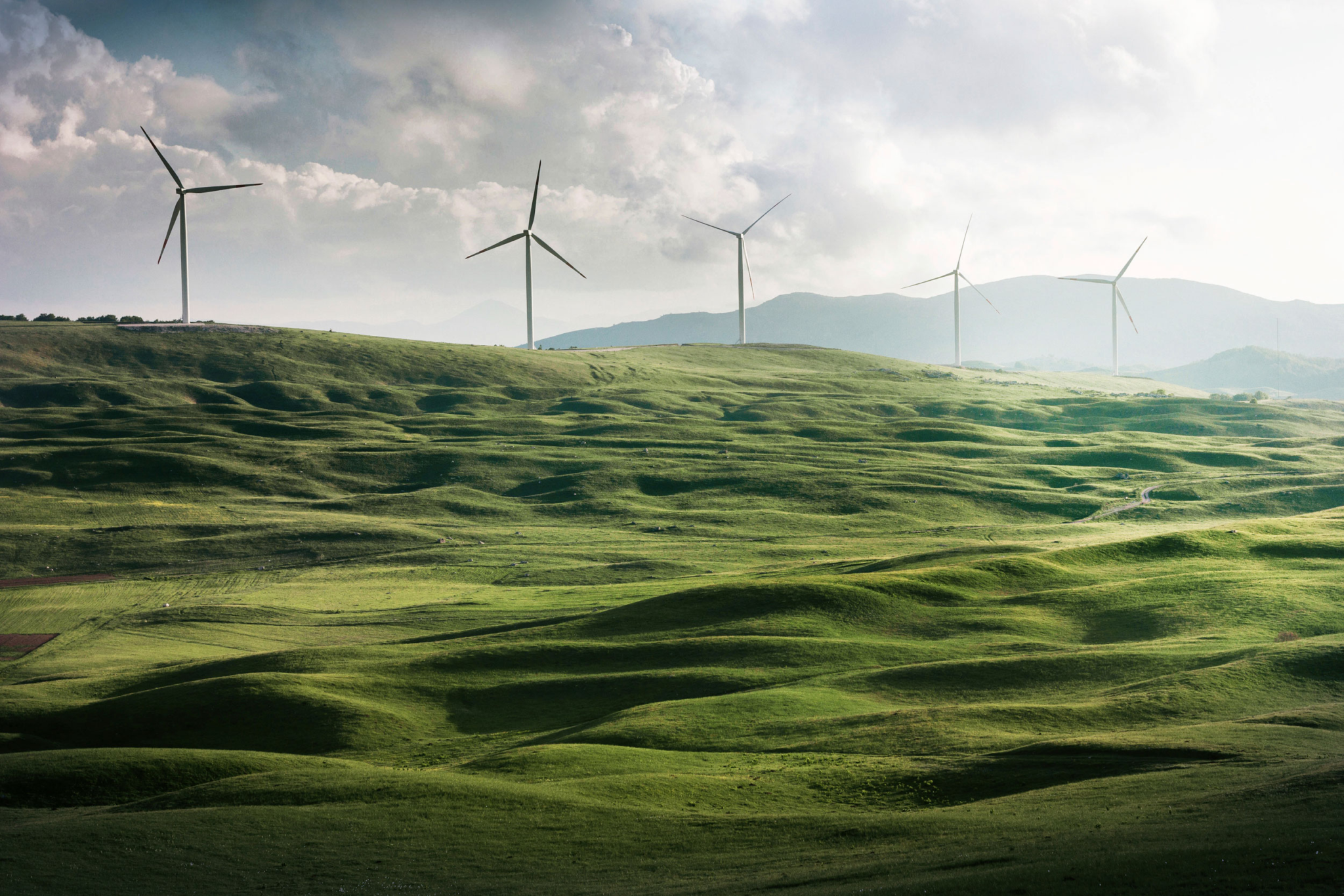
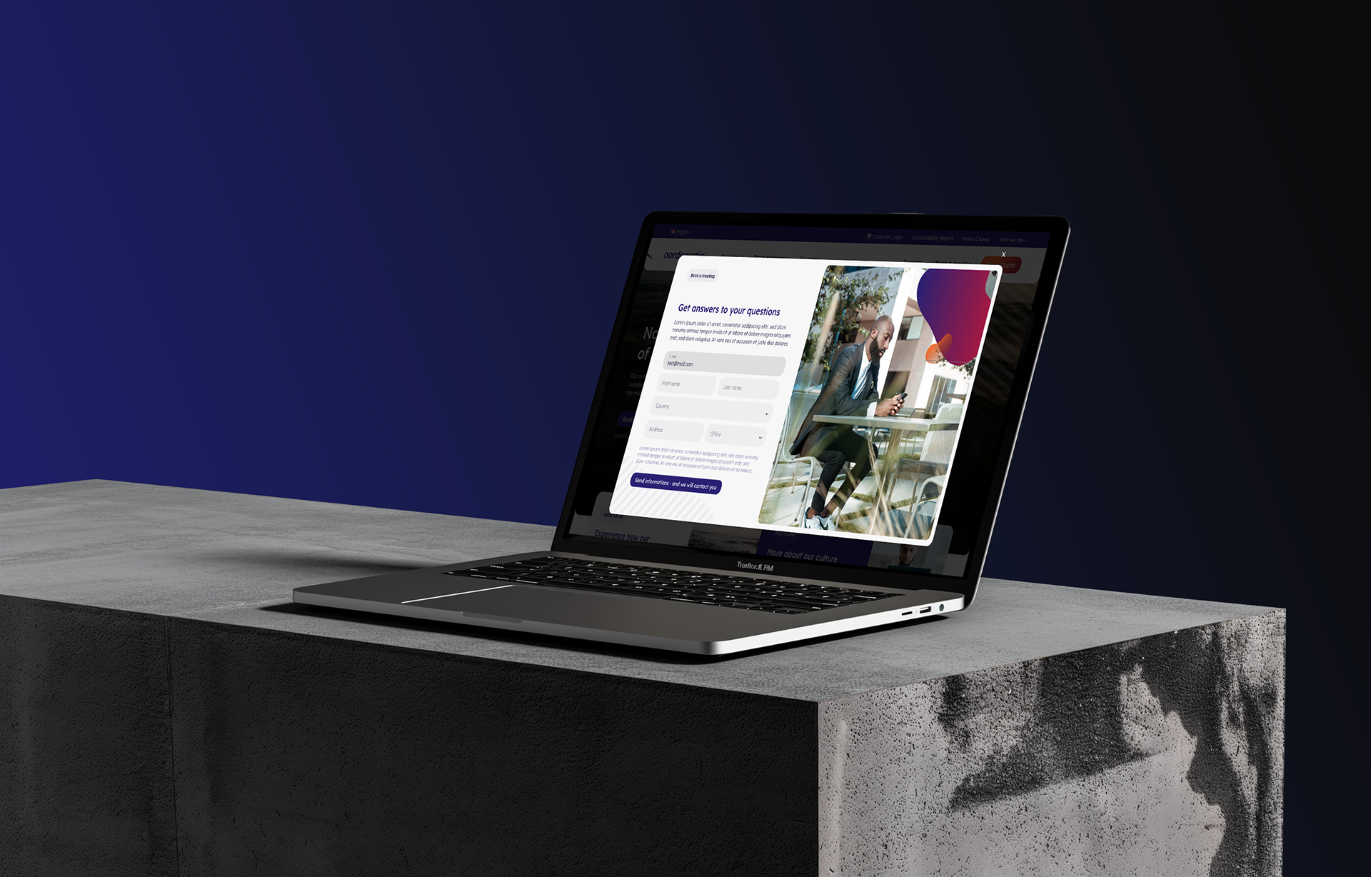
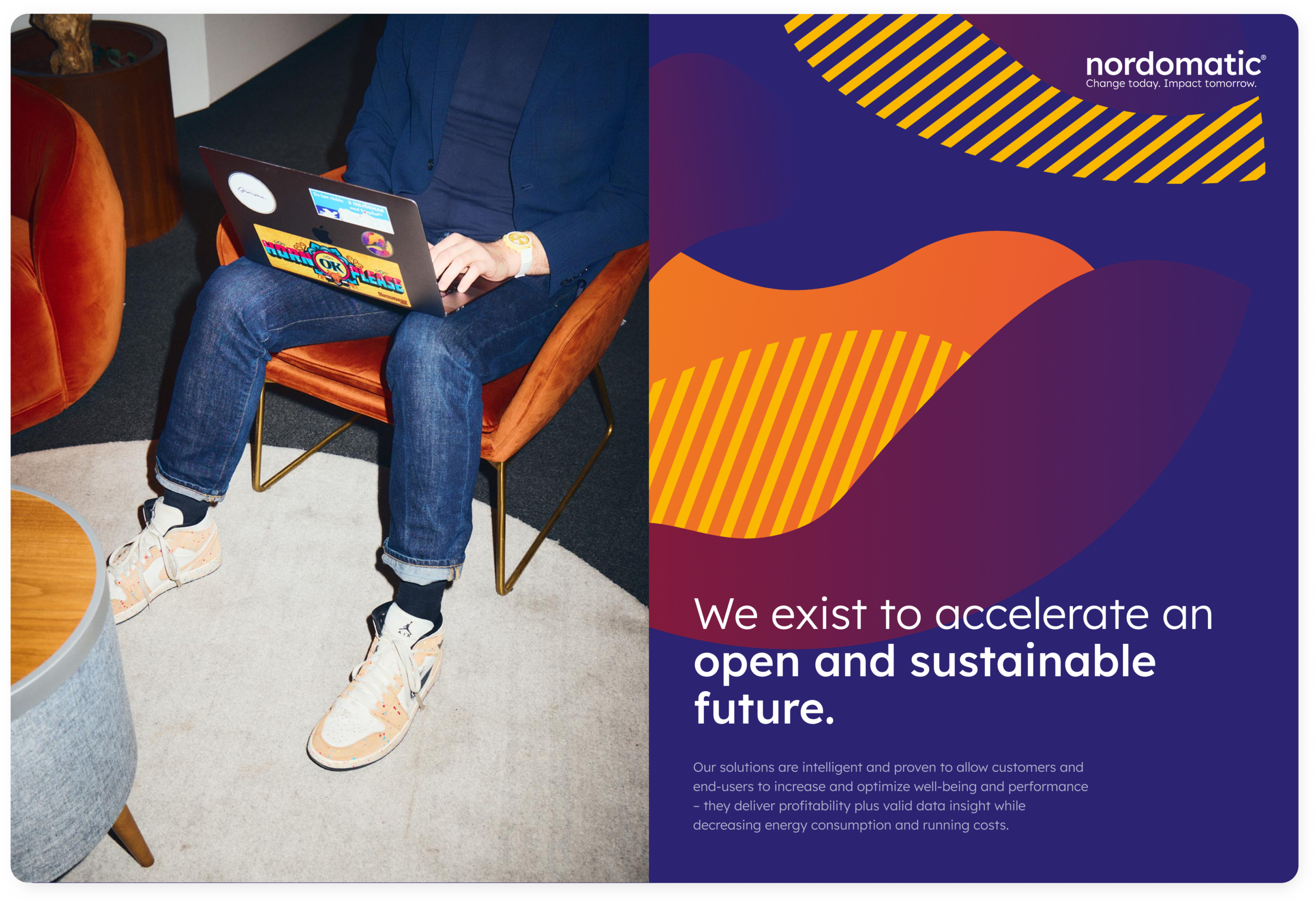
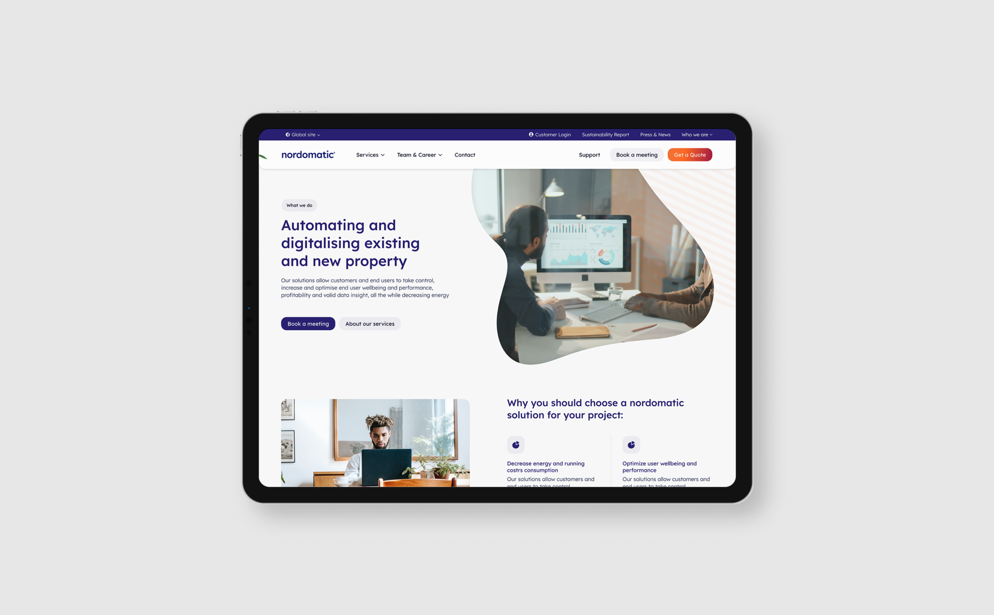
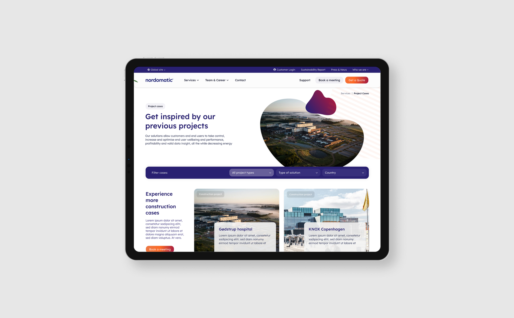
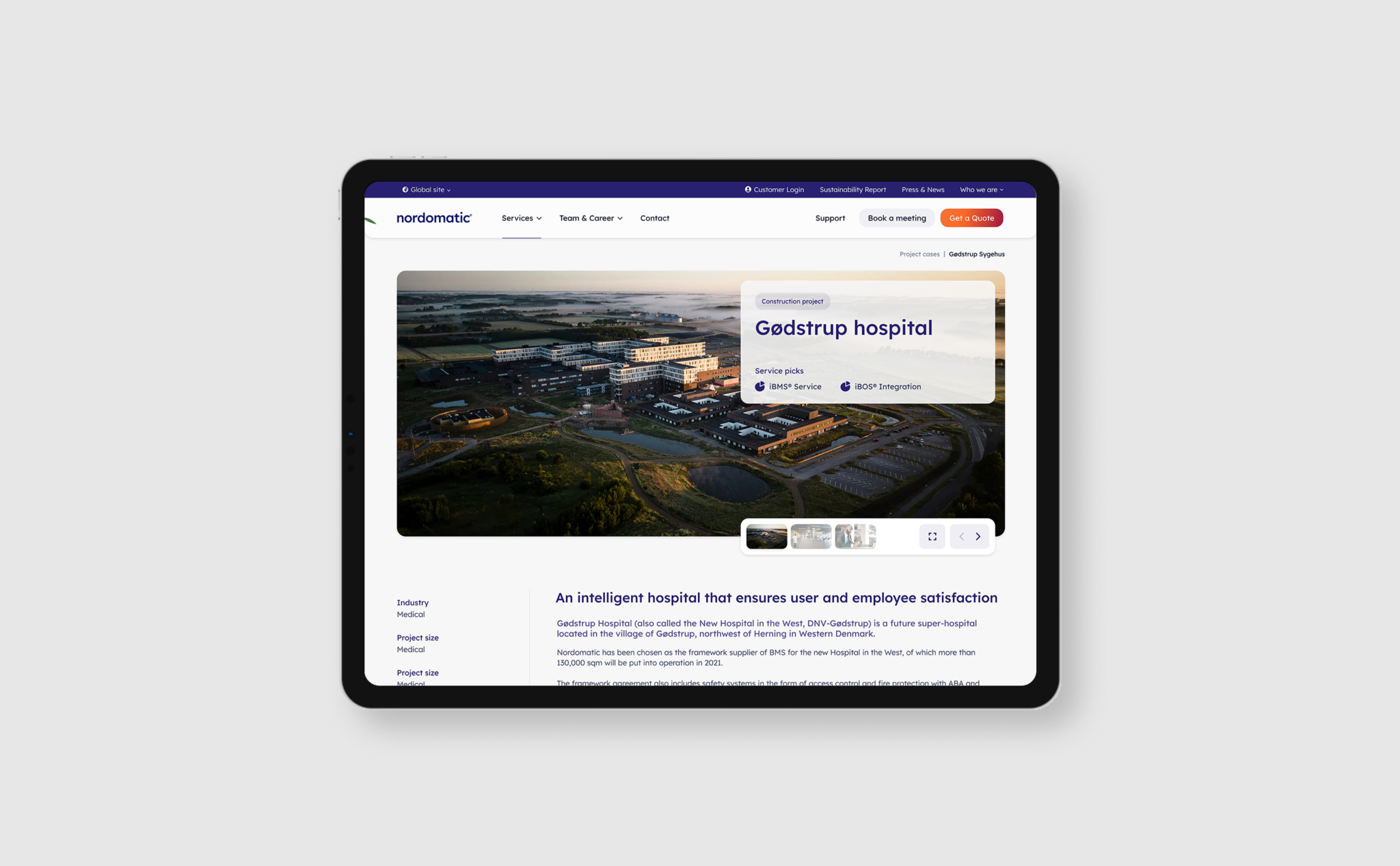
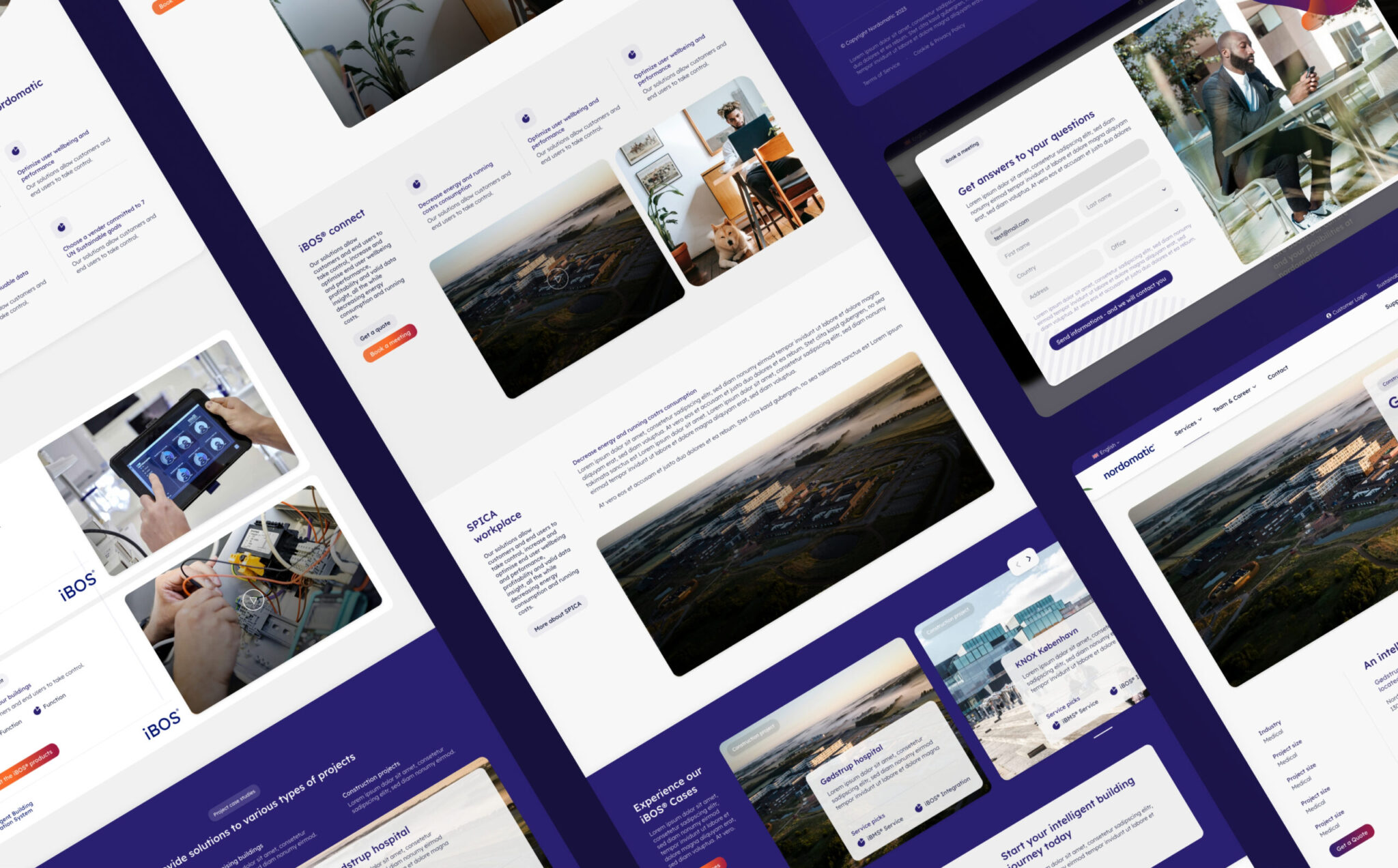
Nordomatic needed a bold and colourful brand identity that could reflect both their technological product offering and their ambition to make a positive difference.
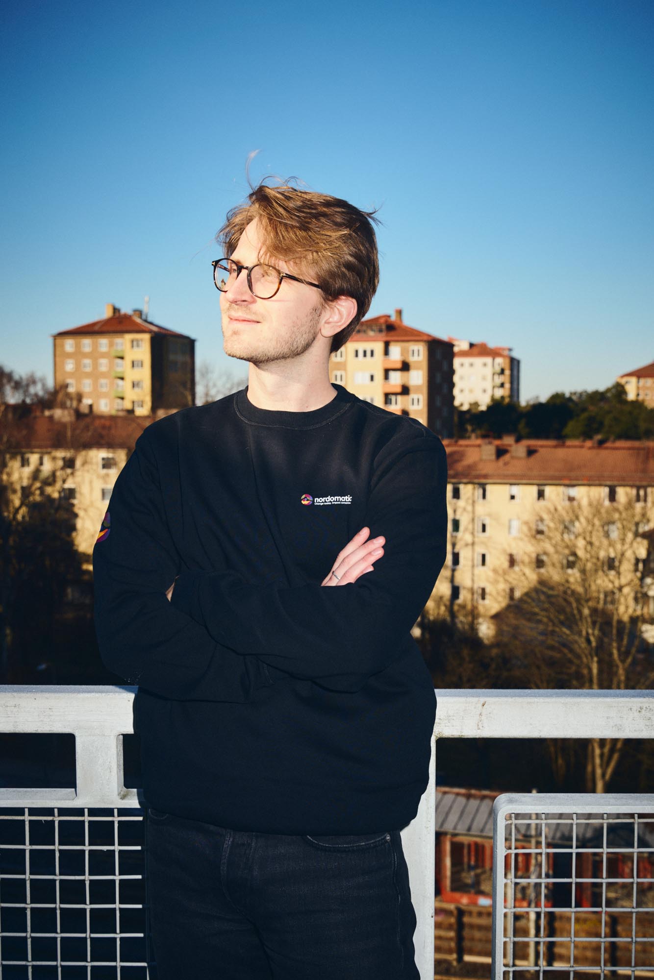
The visual identity was designed to balance the colours of the UN Sustainable Development Goals with the credibility of a serious technology hub. The result was a dynamic brand universe built around gradients, colour shifts and a flexible brand mark used as the primary identity driver.
The identity was then translated into a communication platform focused on conversion — supporting product sales, product presentation and recruitment.
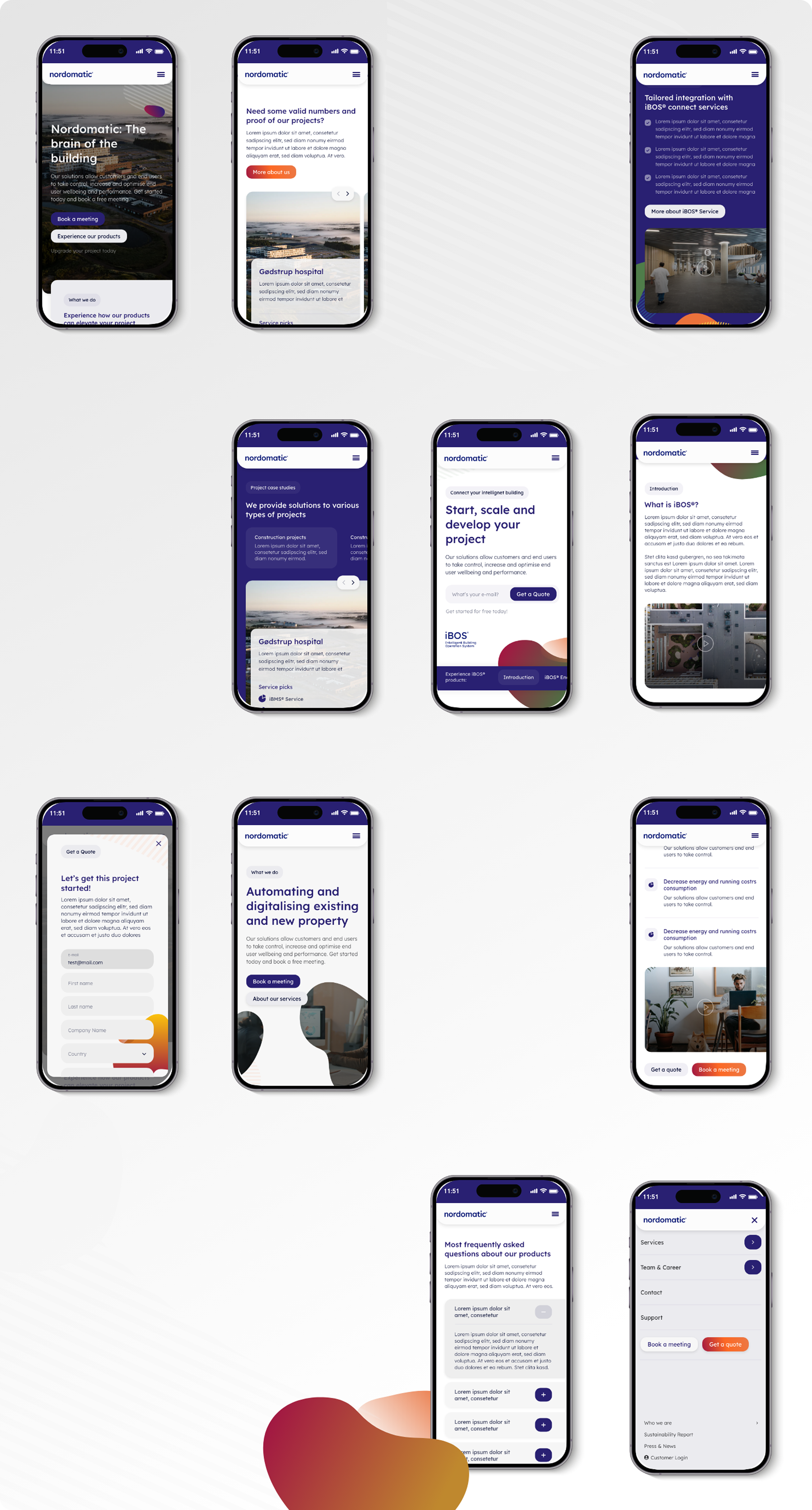
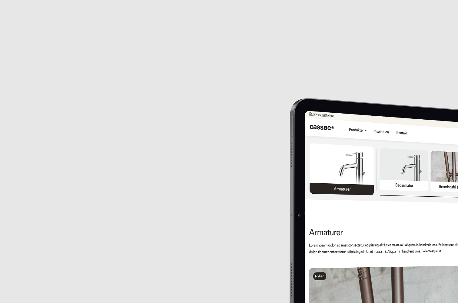
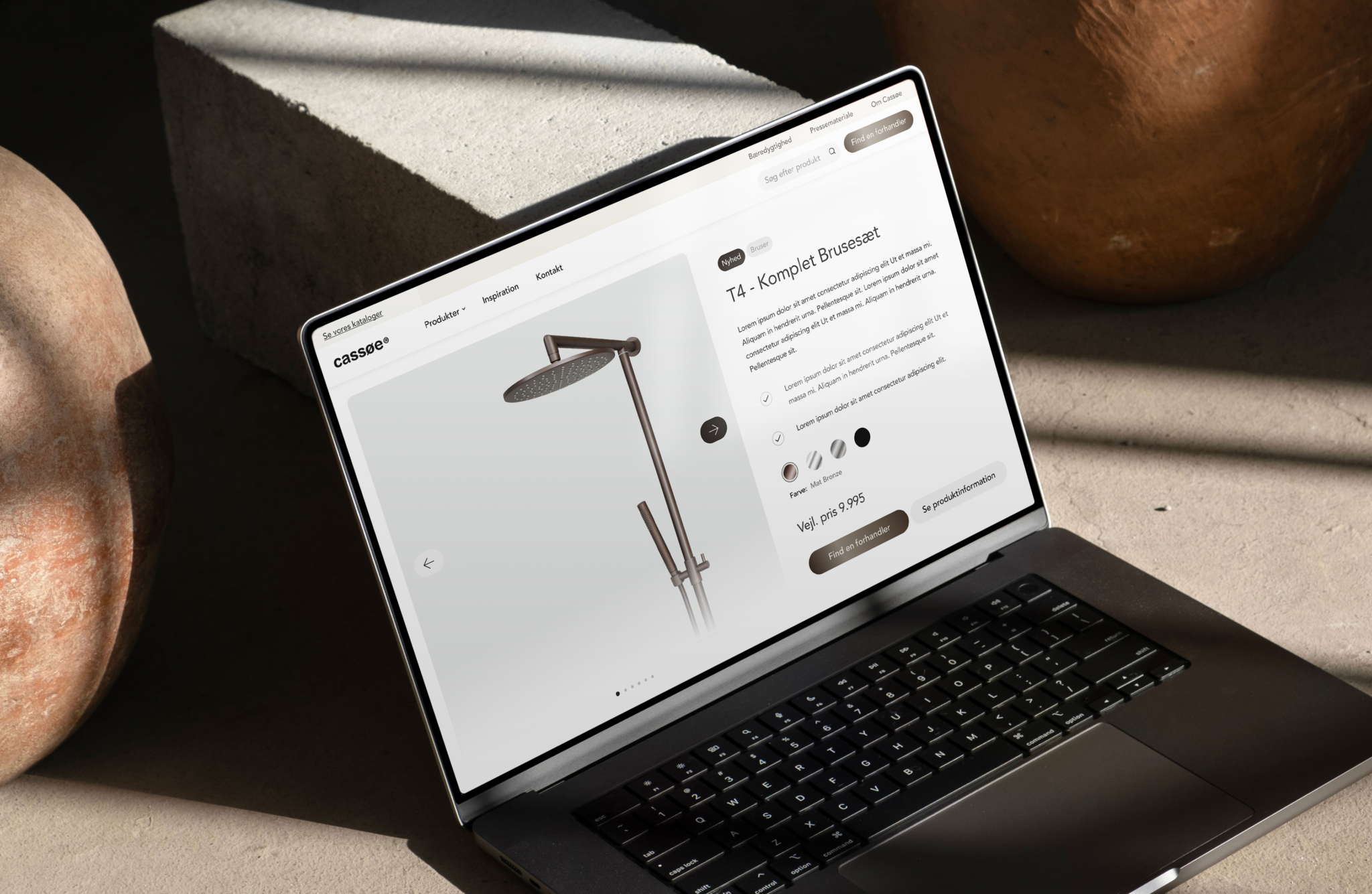
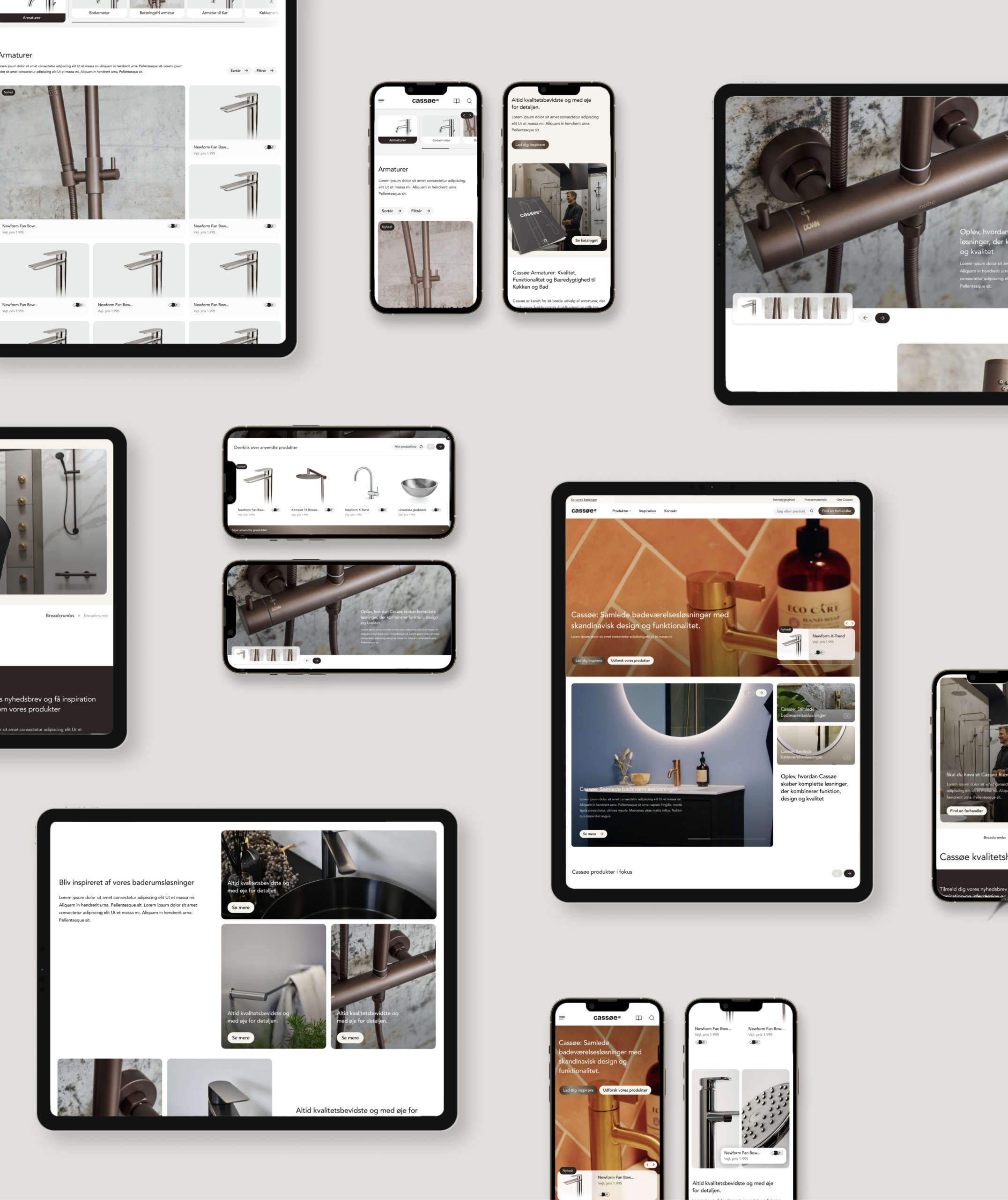
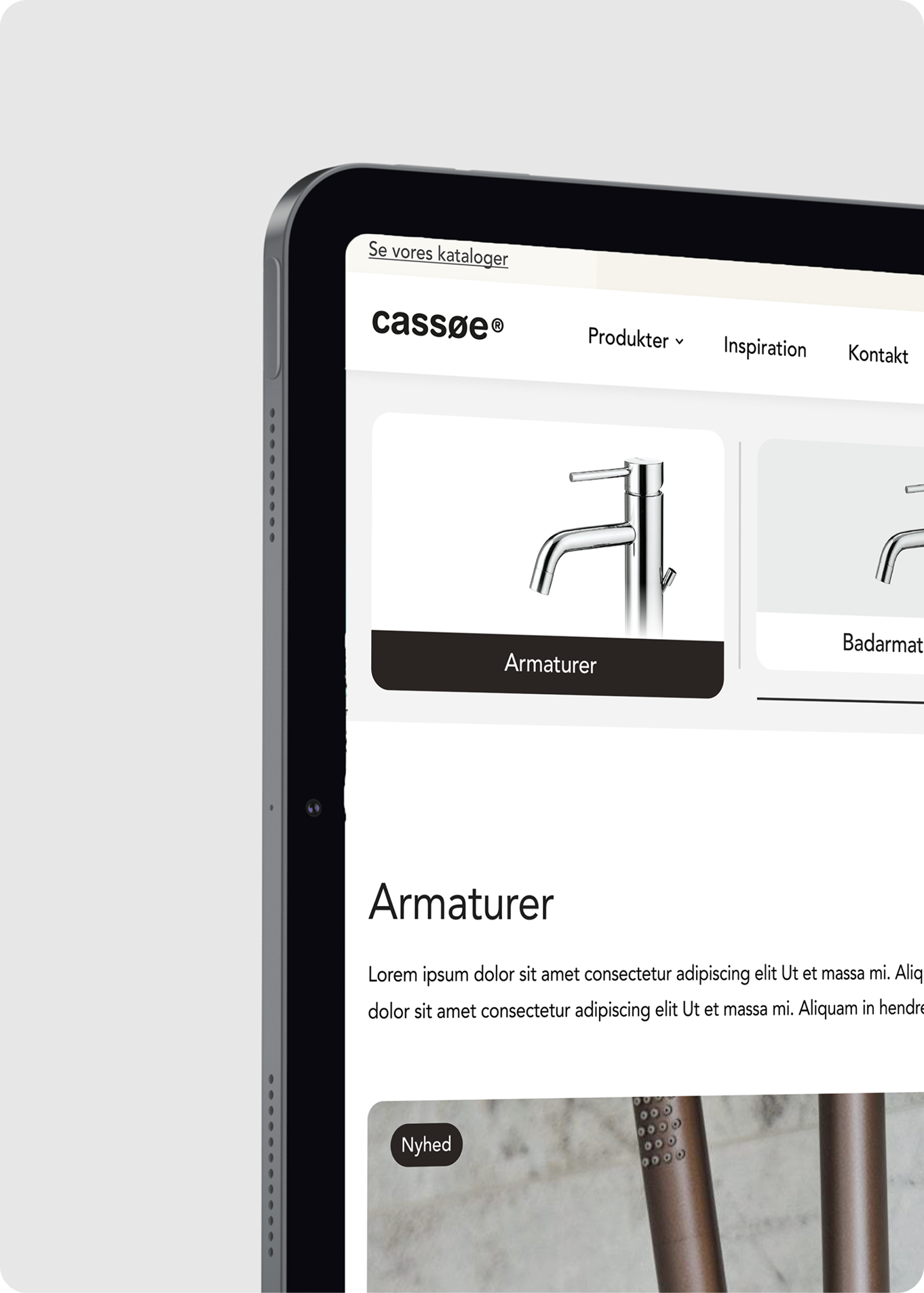
Cassøe needed a brighter and more contemporary digital presence that could reflect the quality of their products and position the brand in a more premium way.
Through market insights and audience understanding, I created a focused brand refresh with a lighter visual expression, refined colours and a more inviting communication platform.
To keep the solution cost-conscious, I designed a small set of flexible modules that brought consistency, clarity and a smoother journey towards conversion.

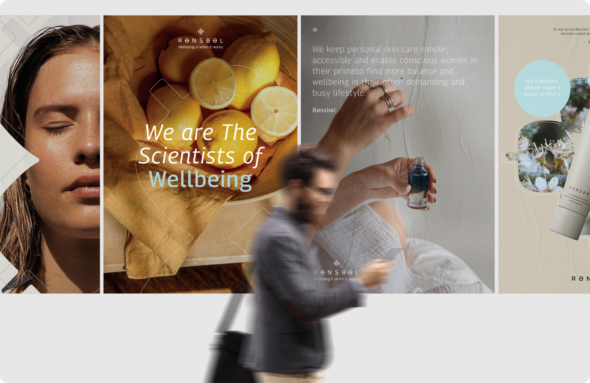
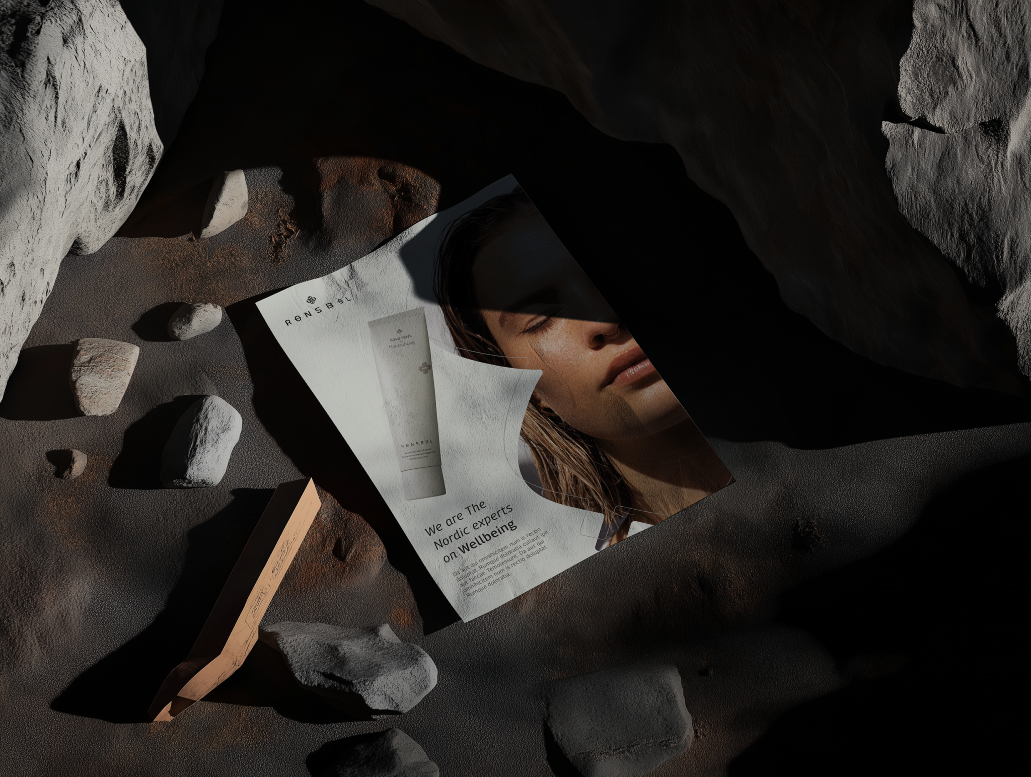
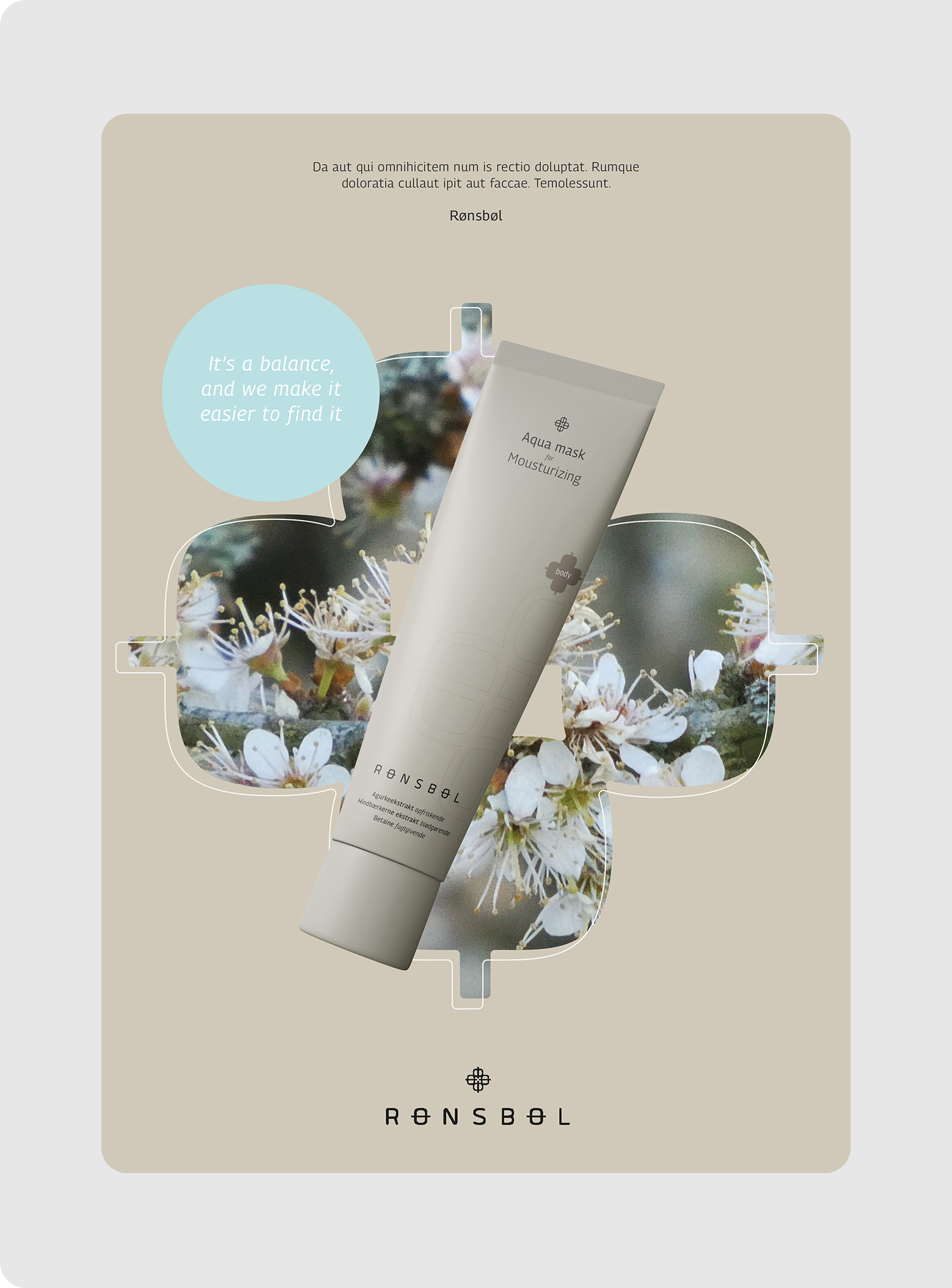
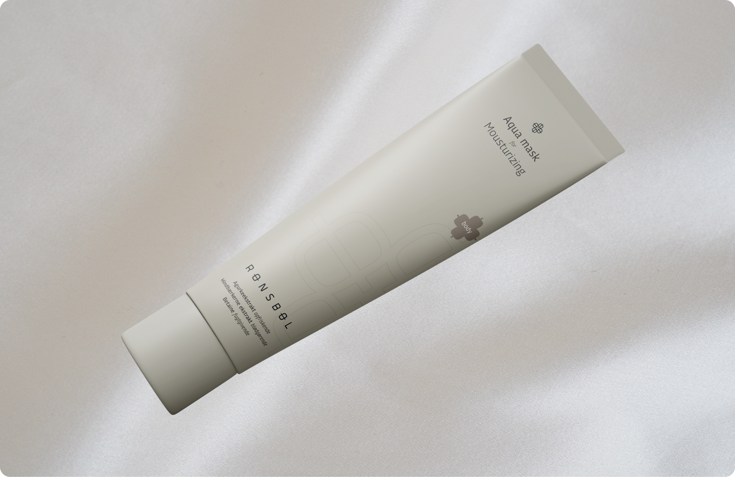
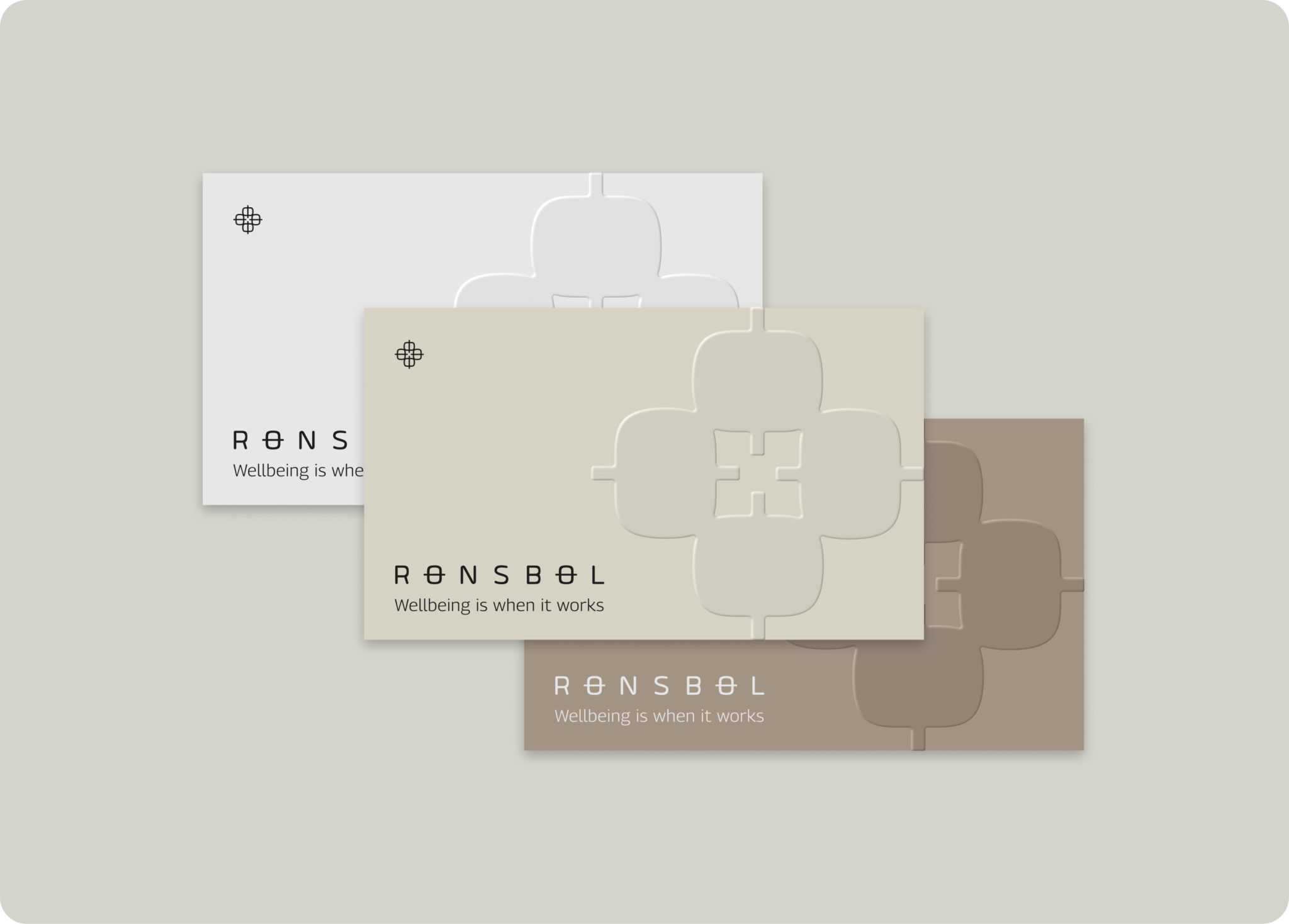
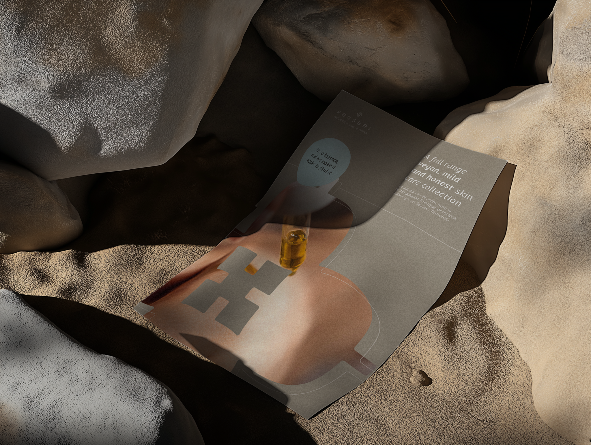
Rønsbøl already had a visual foundation with an existing typeface and selected brand elements. The task was to take these assets and refine the brand expression, making it feel more modern, Nordic and visually cohesive.
The project focused on optimising the existing identity rather than starting from scratch. By working with the brand’s own elements, I explored how the visual system could become more dynamic, refined and flexible across touchpoints. This also included developing a direction for the updated packaging, where the brand needed to feel clean, contemporary and aligned with its existing identity.